#### Specify Packages to Load ####
pkgs <- c(
  "SuppDists", "DHARMa", "ggfortify",
  "tidyverse", "mgcv", "see",
  "lmerTest", "lmtest", "sandwich",
  "faux"
  )

#### Install Packages ####
install.packages(pkgs)Simulated Datasets
Introduction
This section of the website details some simulated datasets to guide inference with DHARMa residuals. By knowing the “true” model with simulation, we know when DHARMa residuals should fail and why. It is recommended that you read the “Getting Started” page before continuing here. The page begins with simple linear equations from ordinary least squares (OLS) regression models that are typically used in the social sciences. After some familiarity with linear equations is achieved, more realistic simulations are created to model complex data.
To run the code in this section, you will first have to install some packages. You can skip this step if you already have these.
Then you just need to load the packages so you can use the functions from them.
#### Libraries ####
library(mgcv) # for GAMs
library(DHARMa) # for DHARMa residuals
library(tidyverse) # for wrangling
library(ggfortify) # for ggplot2-style plots of standard residual checks
library(performance) # for checking model performance
library(lmerTest) # for mixed modeling functions
library(lmtest) # for sandwich estimation...
library(sandwich) # and another pkg for sandwich estimation
library(faux) # for convenient simulation functions

#### Set Plot Theme ####
theme_classic(base_size = 16) # for stylizing plots
Ordinary Least Squares (OLS) Examples
Simulation 1: An “Ideal” Regression Model
Here I will simulate a model which will have “ideal” residuals, in that the model’s assumptions are correct enough that it poses virtually zero problems with inference. First, we have to learn a little bit of linear equation notation. However, if you are not math-savvy, do not be alarmed. This is just for reference, and the simulations, models, and plots will make this all more clear.
To begin, a standard linear equation for ordinary least squares (OLS) regression is often written in scalar notation as:
\[ y_i = \beta_0 + \beta_1 x_i + \epsilon_i \] Where \(y\) is the response variable (what we want to predict), \(\beta_0\) is the baseline average “guess” of \(y\) before considering any predictors in the model (otherwise known as the conditional mean), \(\beta_1\) is how much \(y\) increases or decreases in relation to a predictor \(x\), and \(\epsilon\) is the residual term (the “leftovers” of the model). The \(i\) is an indicator of the individual observation (e.g. a subject in a study) plugged into the regression. An alternative way of stating this is in matrix notation:
\[ Y = X\beta + \epsilon \] The \(X\) here is all predictors from the model (e.g. \(x_1\), \(x_2\), and so on) while the \(\beta\) is a vector of all the coefficients (e.g. \(\beta_0\), \(\beta_1\), and so on). This equation shows what the predicted response, \(\hat{Y}\), is based on all the inputs in our model:
\[ \hat{Y} = X\beta \] The \(X\beta\) part is sometimes referred to as the linear predictor (Wood, 2017, p.XVII), which will be important later when we discuss generalized models. The model for our specific simulation (using the first notation) is as follows and mimics the example from the “What is DHARMa?” page. Let us assume we think that IQ is predicted by age with the following inputs:
\[ \text{IQ} = 50 + \text{(5 x Age)} + \epsilon \] Which assumes that the baseline value of IQ is 50 (when age is equal to zero). This is an often implausible but baseline “guess” for the response (since we won’t have zero-year-olds in our sample). IQ will correspondingly increase by 5 units every time age increases by 1 year. The error, \(\epsilon\), is often assumed to be normally distributed around zero. For this simulation, we will force age to be continuous. Note in the “Get Started” page the values are rounded to show the more discrete levels of age.
Now let’s create some data based on this equation. We will use \(n = 1000\) “subjects” sampled from the “population” in our simulation. We set the random seed with set.seed() using any number so that the simulation can be replicated later. We will assume that our sample includes young subjects around 10 years old.
#### Simulate Normal Data ####
set.seed(123) # for replication
n <- 1000 # 1,000 subjects
x <- rnorm(n = n, mean = 10, sd = 2) # normal distribution for x (predictor)
y <- 50 + 5*x + rnorm(n = 1000, mean = 0, sd = 10) # our linear equation (for the response)
df.normal <- data.frame(age = x, iq = y) # store named variables into data frame
fit.normal <- lm(formula = iq ~ age, data = df.normal) # fit OLS model
To visualize this data and its regression line, we can either use the simple base R method…
#### Plot Scatter ####
plot(
  x = df.normal$age,
  y = df.normal$iq,
  xlab = "Age",
  ylab = "IQ",
  main = "IQ Predicted by Age"
  )

#### Add OLS Regression line ####
abline(fit.normal) 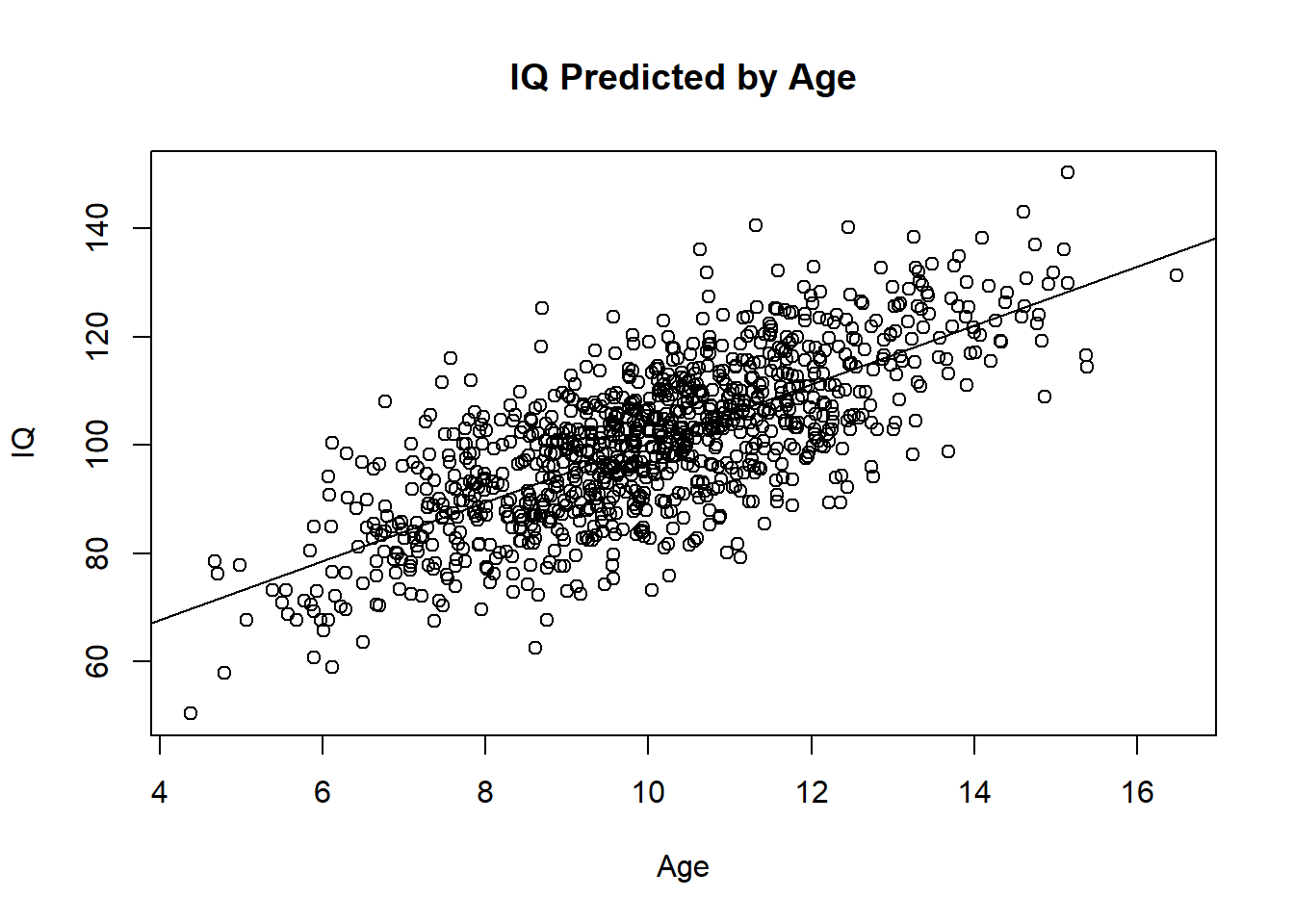
Or spice it up with ggplot2 code for those familiar with the tidyverse package:
df.normal %>%
  ggplot(
    aes(age, iq)
  )+
  geom_point(
    color = "gray",
    size = 5
  )+
  geom_smooth(
    method = "lm",
    formula = y ~ x,
    color = "black"
    )+
  labs(
    x = "Age",
    y = "IQ",
    title = "'Ideal' OLS Model"
  )+
  scale_x_continuous(n.breaks = 10)+
  scale_y_continuous(n.breaks = 10)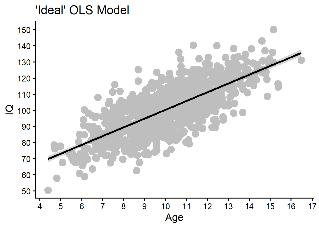
The plot shows us this is as good as it gets…the association is clearly positive and there don’t already appear to be strange artefacts in the data. To assess this, we can generate 4 standard plots for residual analysis that normally come with lm() fitted objects. We can use autoplot() to make them more customized.
autoplot(fit.normal)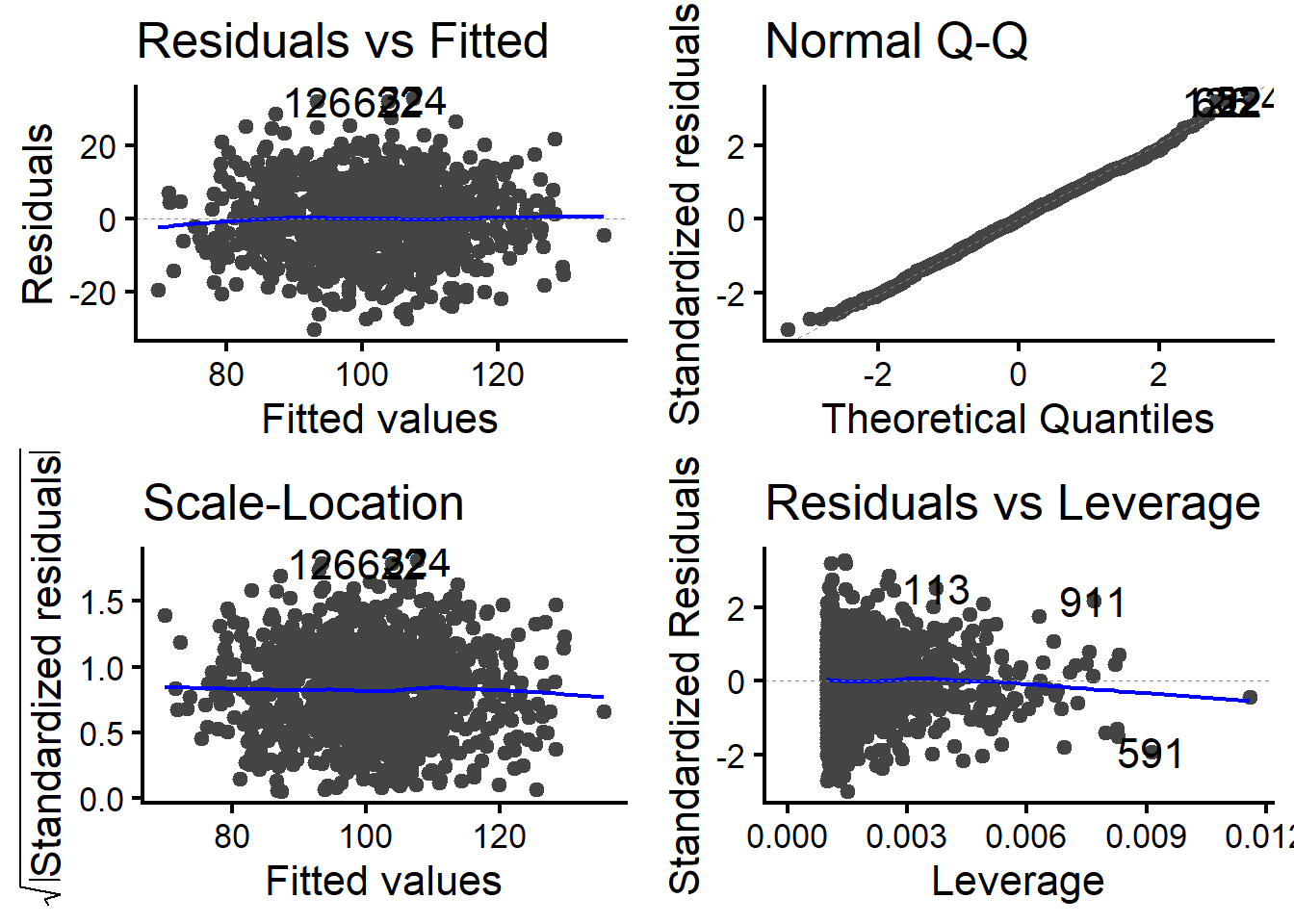
In this case, we see no major problems. The top-left plot should have no patterns in the data, with a flat LOESS regression line shown in blue (as we have here). The top-right plot should have dots that closely hug the QQ-line, which here it does. The bottom-left plot should be similar as the top-left, in that there should be no obvious patterns, particularly positive or negative trends. Finally, the bottom-right plot shows if there are any outliers, where here it doesn’t appear this is the case.
To show how DHARMa residuals compare, we just have to create a simulation object in R with simulateResiduals() and then plot that object.
sim.normal <- simulateResiduals(fit.normal)
plot(sim.normal)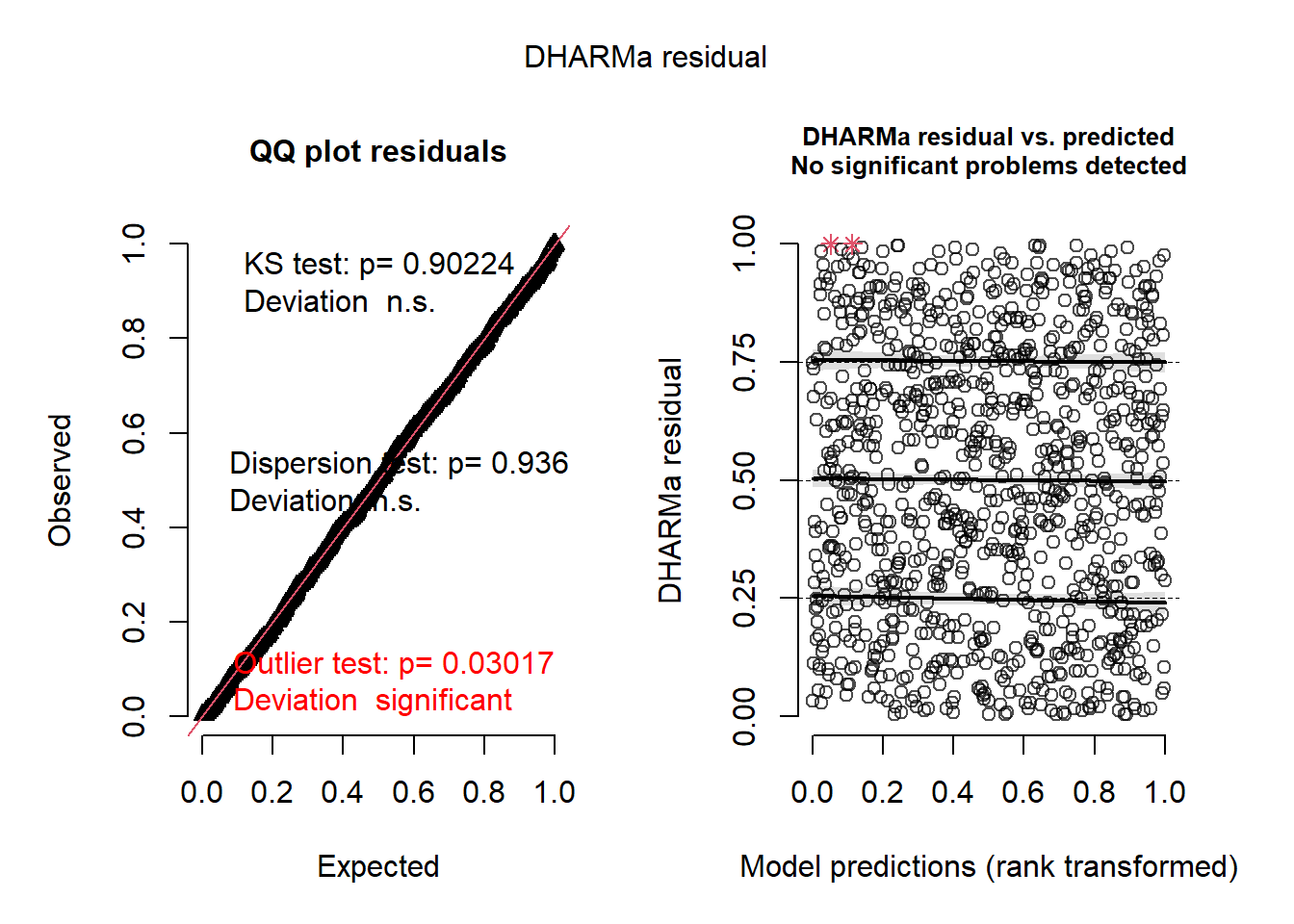
Here we see two plots that are the defaults from DHARMa. The left plot functions almost exactly like the QQ-line we saw before, only now it assumes a uniform distribution instead of a normal distribution. Do not be alarmed by the red outlier test. As noted in the “Getting Started” page, the statistical tests in DHARMa are quite sensitive (particularly with large data) and should be treated with caution (Hartig, 2017; Shatz, 2024). Since we do not see any major outliers in our data, we can safely ignore this (as it is likely just an overpowered test from our large sample). The plot on the right shows a quantile generalized additive model (QGAM, Fasiolo et al., 2021) of the predicted values and the residuals (which is essentially equivalent to the first plot from earlier). Here the lines should be parallel, straight, and have no obvious patterns in the dots. We can see in this case we are safe (for the rationale behind these plots, see the DHARMa vignette) and the “What is DHARMa?” page.
Simulation 2: Unequal Variance
One of the assumptions of OLS regression is equal variance, otherwise known as homoscedascity. When the variance is unequal, we call this heteroscedascity (Westfall & Arias, 2020). Generally speaking, we don’t want this in an OLS model, as it may produce inaccurate standard errors, confidence intervals, and p-values as a consequence. To demonstrate what happens to our residuals in a case like this, we will now simulate such a model. Here we equation will be very similar, but we will add an error term that increases with the predictor.
\[ \text{IQ} = 50 + (10 \times \text{Age}_i) + \epsilon_i \]
\[ \epsilon_i \sim N(0, e^{\text{Age}_i}) \]
We will also impose some constraints (so that the values are not so extreme), but our simulation will basically follow this equation. We will also make the sample size smaller (\(n = 200\)), as heterogeneity is less of an issue with larger sample sizes (Gelman et al., 2022; Westfall & Arias, 2020).
#### Simulate New X ####
set.seed(123)
nh <- 200
xh <- rnorm(n = nh, mean = 10, sd = 3)

#### Simulate New Y ####
mu <- 50 + 5*xh # linear predictor
sigma <- pmin(exp(xh/5), 30) # grows fast, capped at 30
yh <- mu + rnorm(n = nh, mean = 0, sd = sigma)

#### Merge Data and Fit to Model ####
dfh <- data.frame(age = xh, iq = yh)
fith <- lm(iq ~ age, dfh)
Once again, we can draw a simple regression line through a base R plot…
plot(
  x = dfh$age,
  y = dfh$iq,
  xlab = "Age",
  ylab = "IQ",
  main = "IQ Predicted by Age"
  )

abline(fith)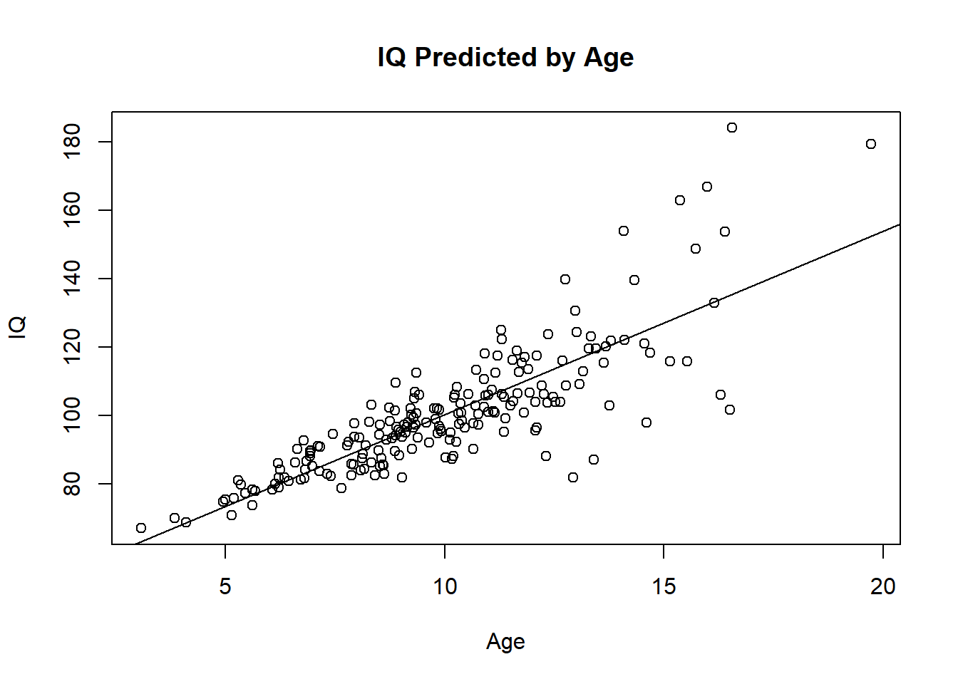
Or with ggplot2…
dfh %>%
  ggplot(
    aes(age,iq)
  )+
  geom_point(
    color = "gray",
    size = 5
  )+
  geom_smooth(
    method = "lm",
    formula = y ~ x,
    color = "black"
    )+
  labs(
    x = "Age",
    y = "IQ",
    title = "Simulation of Heteroscedascity"
  )+
  scale_x_continuous(n.breaks = 10)+
  scale_y_continuous(n.breaks = 10)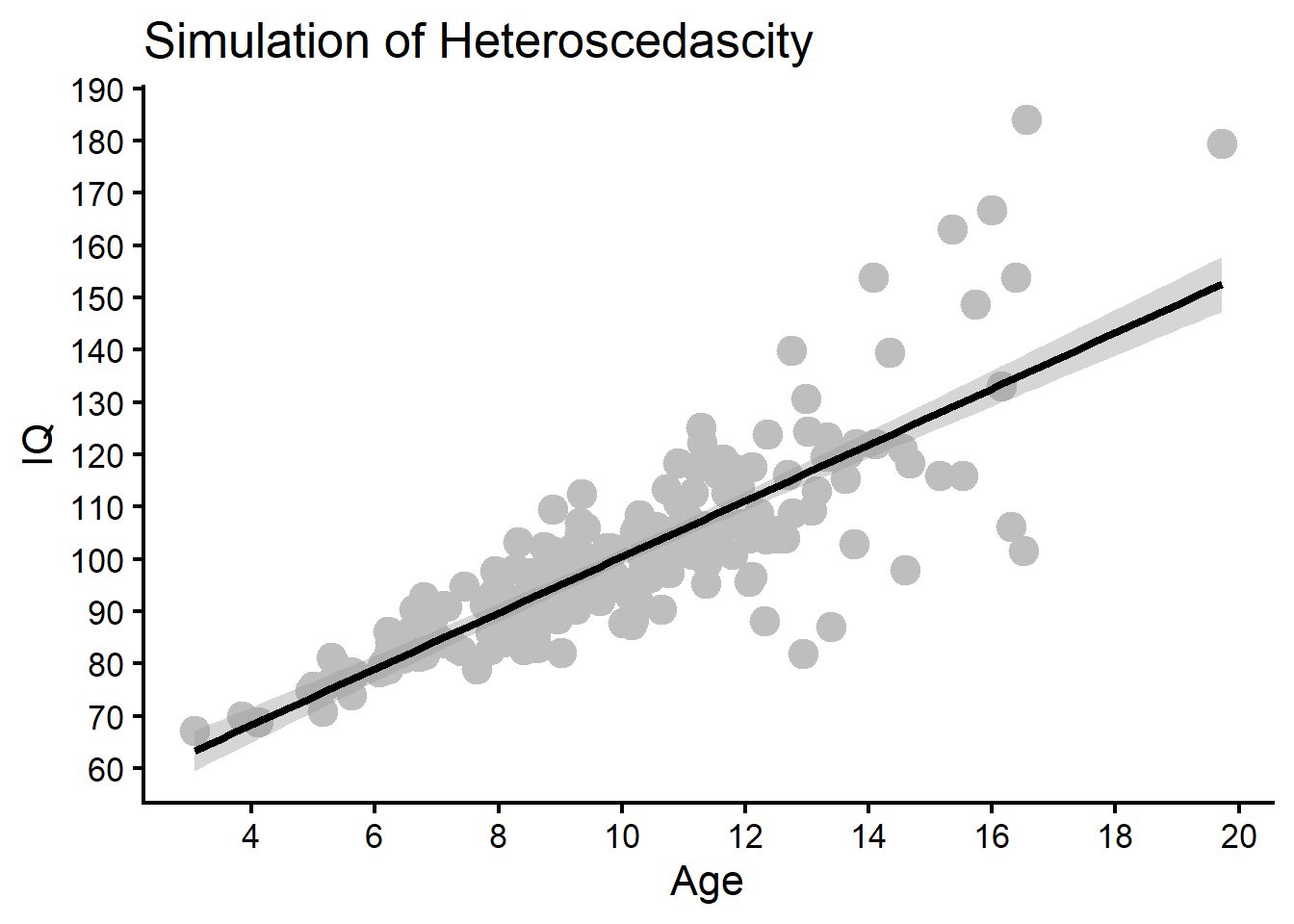
Looking at the scatterplot, we can see that the dots spread out as the predictor increases, which is what we should expect. Running the standard residual plots should show problematic patterns, particularly for this sample size.
autoplot(fith)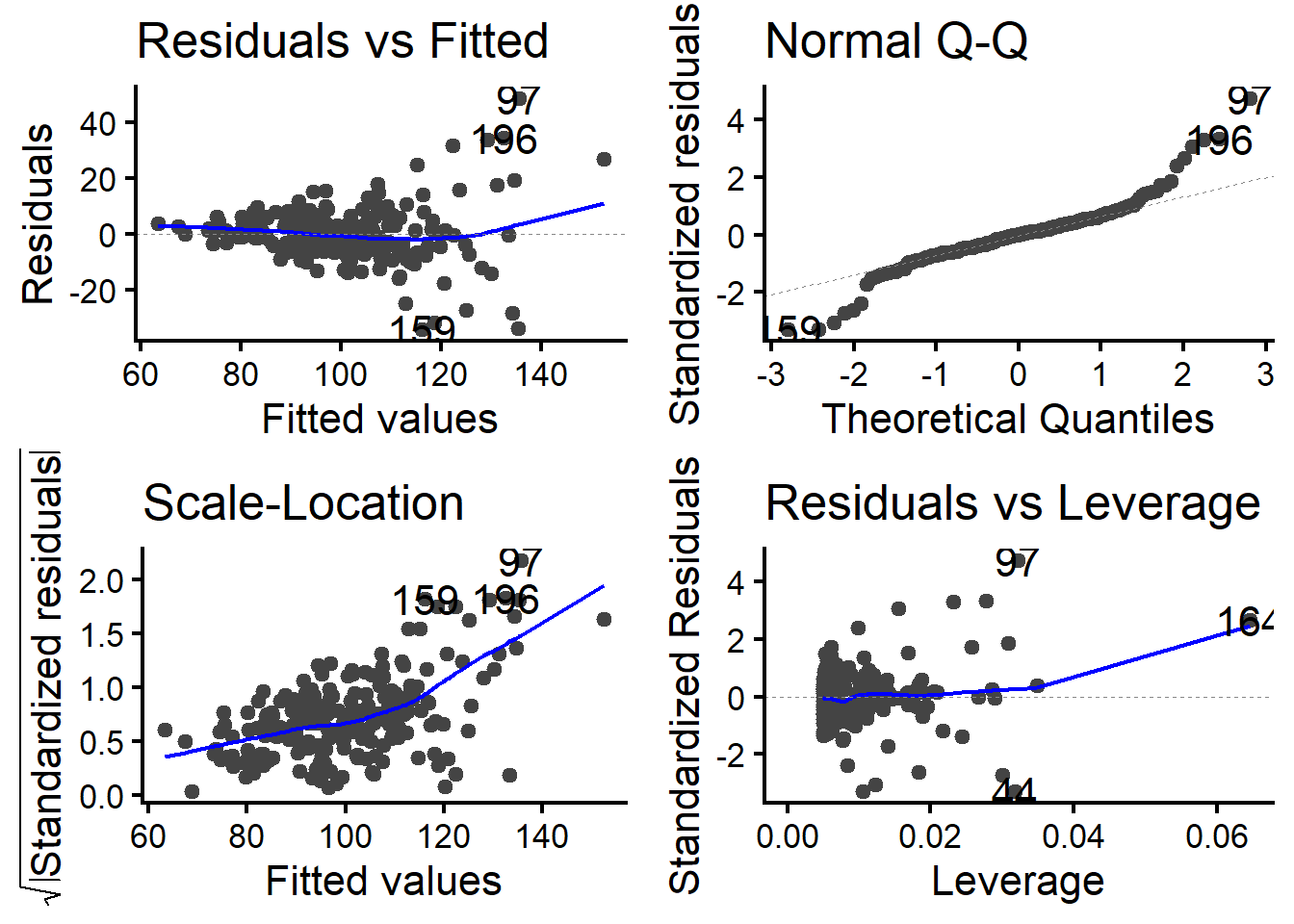
We can see a few problematic patterns. The first plot shows a typical “funnel” shape, where the data points spread out as the fitted predictor values show (as our raw scatterplot indicated already). The QQ plot also has odd tails that deviate noticeably from the line. The scale-location plot shows a positive trend, indicating again that the variance shifts by predictor values. There are otherwise no problems in the residuals vs leverage (outlier) plot.
Running this in DHARMa shows similar concerns, where here we will see more obvious visual differences from our earlier model.
simh <- simulateResiduals(fith)
plot(simh)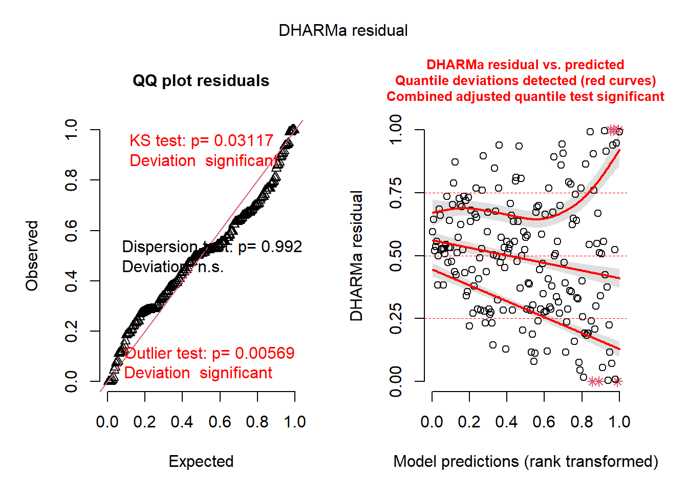
Both of our plots are now noticeably odd. The dots in the left plot noticeably deviate from the QQ line. The QGAM plot on the right shows that the association is negative for the Q25 quartile of the distribution (lower values of the response) and has a positive association for Q75 (higher values of the response). The association is noticeably flat for the median Q50. All of this matches what we saw earlier and produces a similar fan shape to our scatterplot and earlier residuals. A simple correction to this is applying a sandwich estimator for standard errors to adjust for this. We will use “HC3” as it generally performs best under simulation (Long & Irvin, 2000). This is shown below:
v <- vcovHC(fith, type = "HC3")
c <- coeftest(fith, vcov. = v)
The confidence intervals for the original model shown below:
confint(fith) 2.5 % 97.5 %
(Intercept) 41.550844 52.214636
age 4.842423 5.871159For the sandwich estimator, they are shown below:
confint(c) 2.5 % 97.5 %
(Intercept) 39.310689 54.454790
age 4.490309 6.223273The difference in the confidence intervals is not so extreme, but we see the sandwich estimator produces more accurate estimates given the heterogeneity of variance.
Generalized Models
Simulation 3: Modeling a “Healthy” Binary Response
Let’s first look at a “healthy” version of a model which predicts binary responses. Let us assume that those who stay longer at a job will eventually quit. In other words, there may be a positive linear association between how many years you spend at a job (a continuous variable rounded by how many months there are) and the event of quitting (a binary event, where quitting = 1 and not quitting = 0). We will return to why this relationship might not be plausible in a moment, but first, let’s simulate our data.
Since our data generating process will produce binary outcomes, we will adopt the same linear equation tactics we used earlier, only we will have to make a slight tweak because of the expected distribution used. The linear predictor, \(X\beta\), for our response is:
\[ X\beta = -3 + (1 \times \text{Years}) \] You can think of this equation in a similar way as the OLS example earlier before transformation. The first coefficient (number) is again the intercept, or the baseline of quitting. We set this sufficiently low (here -3 on the logit scale) so that the probability of quitting when years = 0 is low. Then to induce a linear positive association, we make the slope (the second coefficient in the parentheses) 1, so that a one year increase increases the logit by 1. This equation, like OLS, produces an unbounded response that ranges from \(-\infty\) to \(+\infty\), which makes it a truly continuous response. However, binary data can only range from \(0\) to \(1\), so we have to translate this equation now into a probability.
To summarize what we will do below, we are trying to transform the probability of quitting (Quit = 1), given \(X\) (our predictors), on the left-hand side of the equal sign. The right side achieves this by taking the reciprocal of the linear equation. The first important part is the \(X\beta\) part, which is the linear equation from above. We want to force this to be positive (so it never goes below 0), so we exponentiate it with the \(e\) function. Adding the negative ensures the regression line goes upward towards 1 and not down towards 0. The 1 represents the baseline odds of the event not happening. We then take the reciprocal (dividing everything by 1) to force the values between 0 and 1.
\[ P\{ \text{Quit} = 1 | X \} = \frac{1}{1 + e^{-X\beta}} \] To see this in action, we can create our own logistic function and plug in a range of predicted logits to see what the probabilities become.
#### Create Logisitic Function ####
logistic <- function(x){
  1 / (1 + exp(-x))
}

#### Create Range of Predicted Values From X-Beta ####
preds <- c(-10, -5, -2, 0, 2, 5, 10)

#### Apply Function and Round Values ####
probabilities <- round(logistic(preds), 5)

#### Show Results ####
data.frame(preds, probabilities)
preds probabilities
1 -10 0.00005
2 -5 0.00669
3 -2 0.11920
4 0 0.50000
5 2 0.88080
6 5 0.99331
7 10 0.99995Here we see a range of values which are near zero and near one. For example, if somebody is at the company for one year, this produces the following predicted logit value (before transformation):
\[ X\beta = -3 + (1 \times \text{(Years = 1)}) = -2 \] Which plugged into the equation gives us the following probability:
\[ P\{ \text{Quit} = 1 | X \} = \frac{1}{1 + e^{-(-2)}} = 0.1192 \] Notice this number matches the -2 prediction we plugged in earlier. This can also easily be obtained using the plogis function in R.
plogis(-2)[1] 0.1192029Now that we have that squared away, we just combine these steps. First, we set a random seed (so the simulation can be replicated). Then we simulate a predicted value of years which has a mean of zero and a standard deviation of 1 (we will add some positivity so its more like a year variable). We then create our linear equation \(X\beta\) with our variable and plug that into the rbinom() function. This function randomly simulates a binomial variable. However, it will base the simulations off our linear predictor, so that the binary data produced from this simulation matches what our linear predictor assumes. After, we just merge that data into a data frame.
#### Simulate Logistic ####
set.seed(123)
x <- rnorm(1000) # normally distributed predictor
xb <- -3 + x # linear relationship
p <- 1/(1 + exp(-xb)) # force to probability
quit <- rbinom(n = 1000, size = 1, prob = p) # create response w probability

#### Merge Data ####
df <- data.frame(
  years = x + 5,
  quit = quit
    )
Plotting the data may show us a bit of what R has generated for us:
#### Plot Data ####
plot(
  df$years,
  df$quit,
  xlab = "Years at Job",
  ylab = "Decision to Stay (1 = Quit)",
  main = "Simulated Data (Raw)" # some labels for plot
  )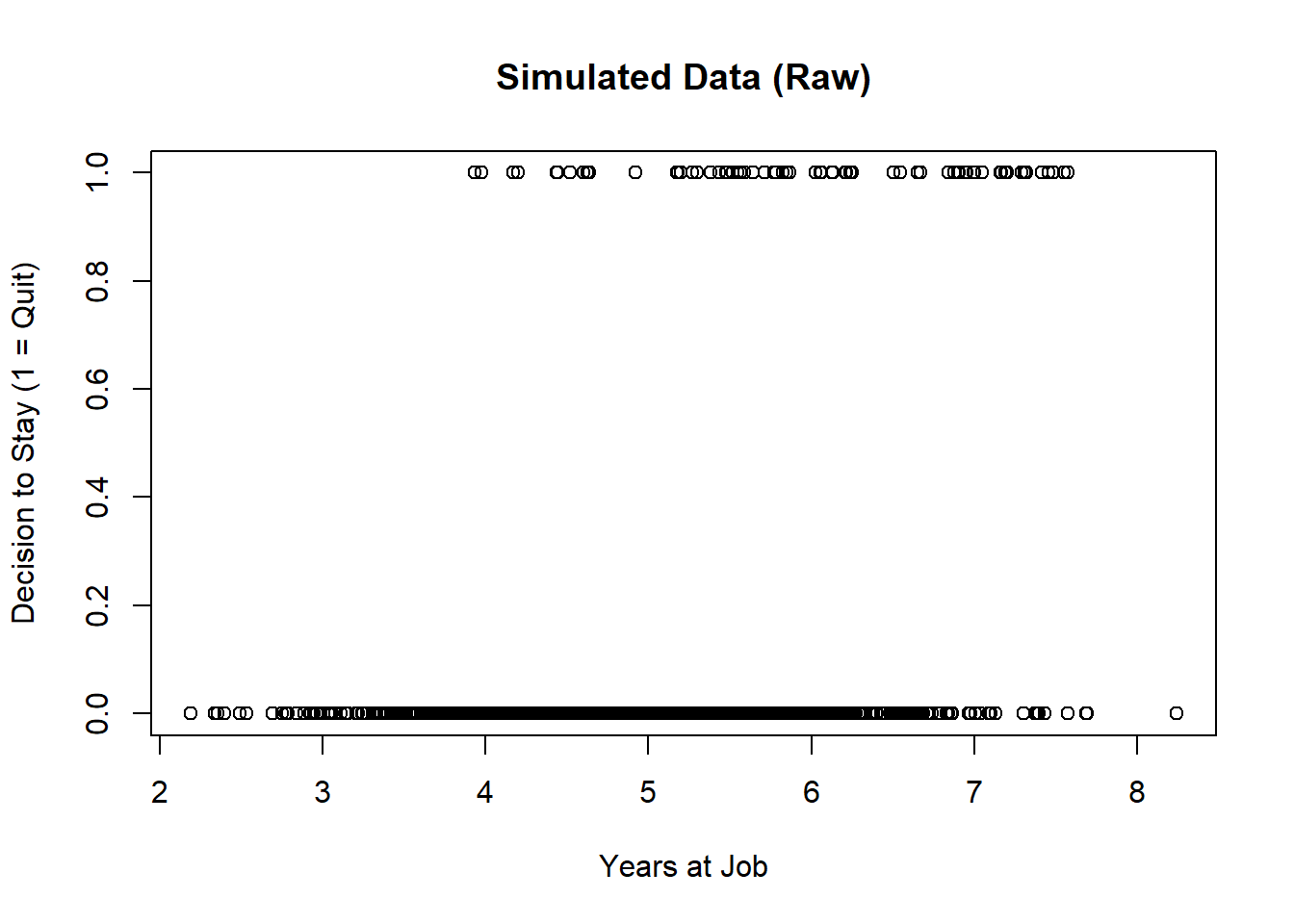
We see two interesting aspects of this plot:
- The data is heavily concentrated on the bottom (where all the zeroes are). This makes sense because we predicted the probability of quitting to be low (without factoring in years at a job).
- We see all the data clustered at the top (where all the ones are) shift a bit to the right. This seems to indicate that there is a more linear change in quitting when years increase. This pattern will become more clear when we move to the next simulated example.
Now we just fit a logistic regression with the glm() function. After we plot the residuals to see if the model is healthy.
#### Fit Model ####
fit.good.binary <- glm(
  quit ~ years,
  data = df,
  family = binomial
)

#### Plot Residuals ####
sim.good.binary <- simulateResiduals(fit.good.binary)
plot(sim.good.binary)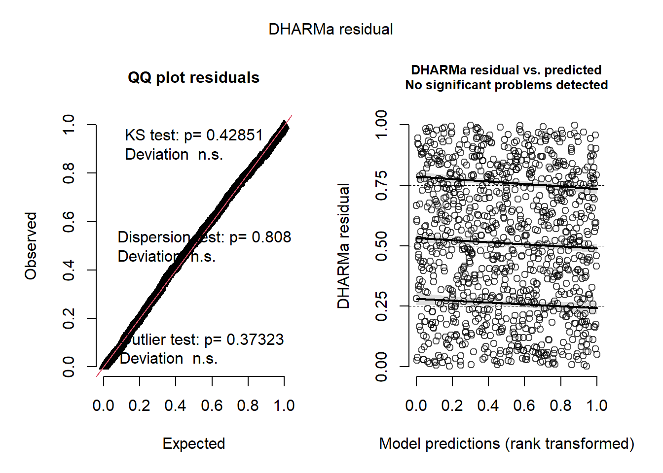
Inspecting the residuals, we see the residuals are quite good. This is to be expected because we fit a model which matches what we simulated. Let’s also plot this data to see what the fitted model looks like:
df %>%
  ggplot(
    aes(years,quit)
  )+
  geom_jitter(
    color = "gray",
    height = .01,
    size = 5
  )+
  stat_smooth(
    method = "glm",
    color = "black",
    method.args = list(family = binomial),
    formula = y ~ x
  )+
  labs(
    x = "Years at Job",
    y = "Probability of Decision to Stay",
    title = "Logistic GLM of Simulated Data"
  )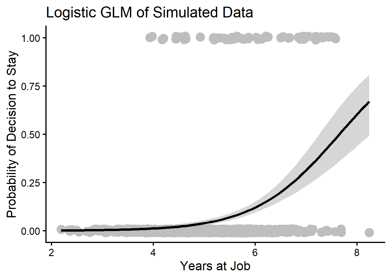
We see that the regression line is what we should expect. Since the probability of quitting is already very low, the logistic regression line doesn’t have a classic “S” curve. However, we see that the increase is still fairly monotonic. Once our simulated participants reach about 5 years at a job, the probability of them quitting drastically increases.
This example shows a very ideal scenario. But what happens if this isn’t the case? We provide an illustrative example in the next section.
Simulation 4: Modeling Nonlinearity with a Logistic GAM
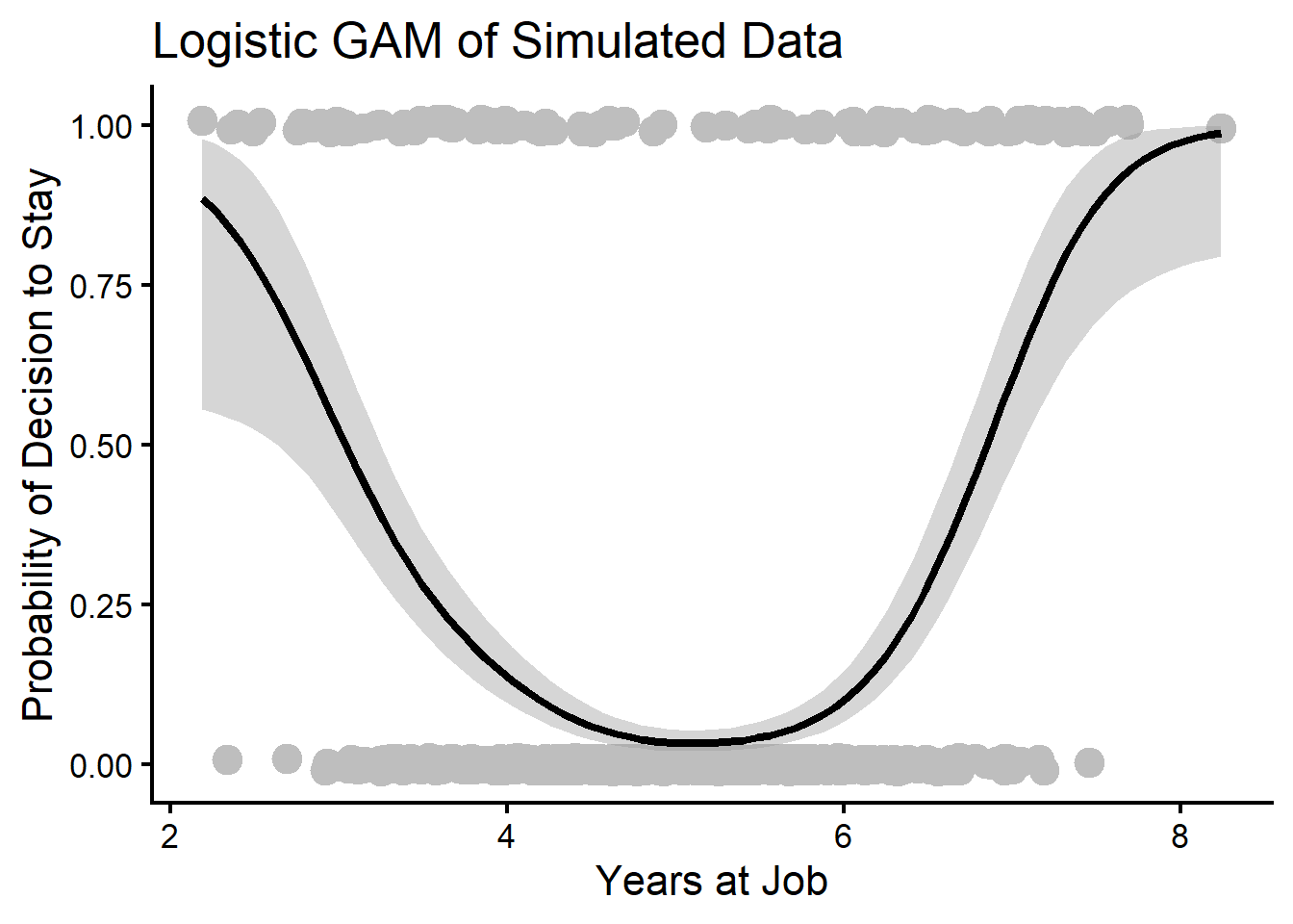
Suppose we have a predictor in logistic regression that has a nonlinear relationship with the response. For example, it may be that those who are new at a job or who have been at a job for a long time quit more often. This is because new employees may do a cost-benefit analysis of their job in the beginning and leave for greener pastures while older employees tend to retire. Perhaps those who are in the middle range of years at a company would likely stay. We can simulate such a relationship by expressing it as another linear equation.
To do this, we just do what we have before…estimate a linear predictor of the response with a specified equation. You may notice a quadratic term has been added to the linear equation, which may induce nonlinearity in our data.
#### Simulate Logistic ####
set.seed(123)
x <- rnorm(1000) # normally distributed predictor
xb <- -3 + x^2 # quadratic relationship
p <- 1/(1 + exp(-xb)) # force to probability
quit <- rbinom(n = 1000, size = 1, prob = p) # create response w probability

#### Merge Data ####
df.logistic <- data.frame(
  years = (x + 5), # +5 otherwise years will be negative
  quit = quit
  ) #

#### Plot Data ####
plot(
  df.logistic$years,
  df.logistic$quit,
  xlab = "Years at Job",
  ylab = "Decision to Stay (1 = Quit)",
  main = "Simulated Data (Raw)" # some labels for plot
  )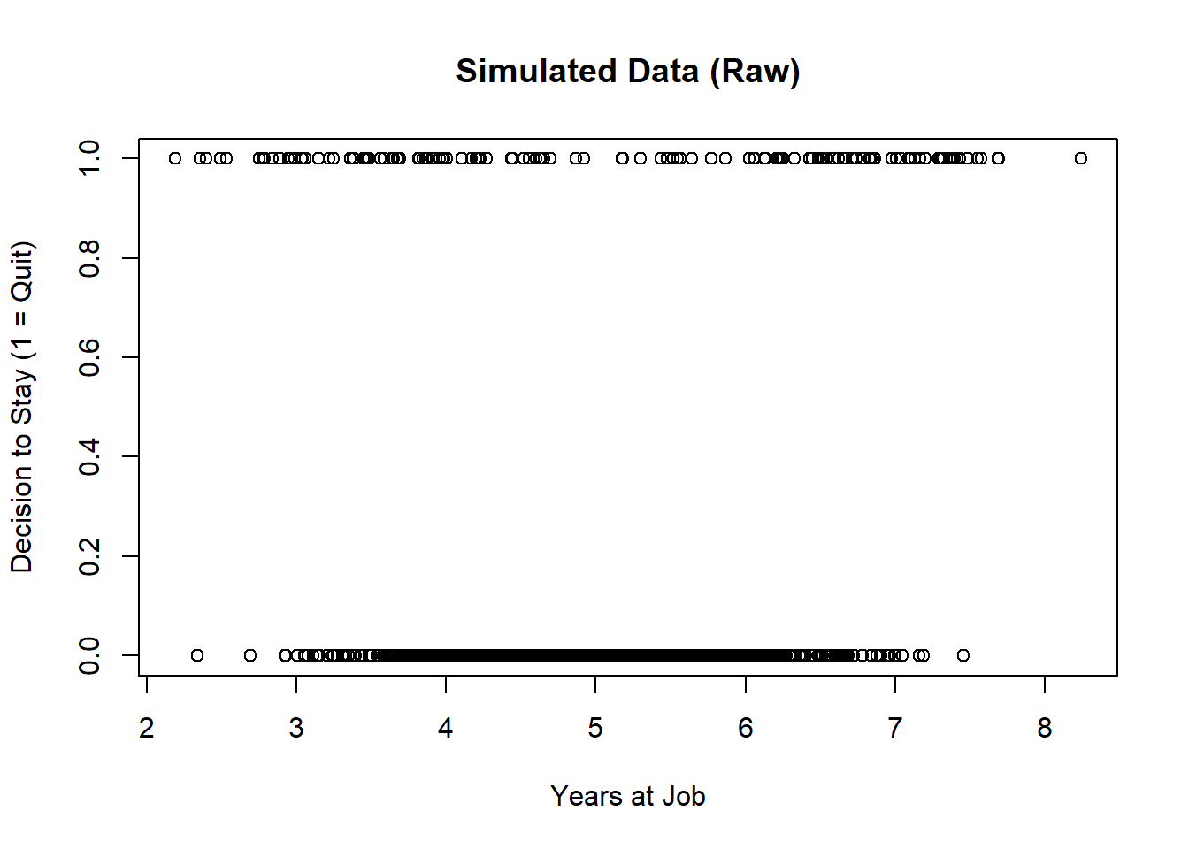
Plotting the data like this doesn’t immediately make it clear what the relationship is yet, but we do see an odd thing where the 0’s (not quitting) tend to concentrate a lot in the middle around 5 years. Conversely, the 1’s (quitting) are more spread out across the range of years. We will first fit an obviously bad model to demonstrate why we wouldn’t normally use standard OLS residuals in this situation.
### Fit OLS Model ####
fit.ols.wrong <- lm(
  formula = quit ~ years,
  data = df.logistic
)

#### Plot OLS Residuals ####
autoplot(fit.ols.wrong)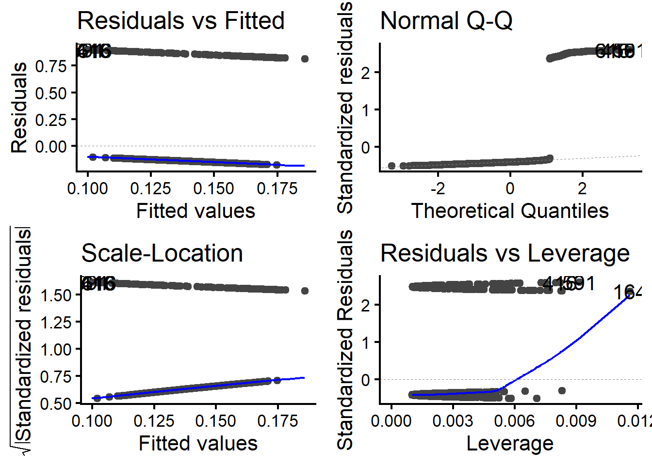
We see here that the residuals aren’t informative at all because the response can only possibly take on two values, 0 = not quit and 1 = quit. Understandably, we shouldn’t expect a normal distribution, and so our plots all look bizarre (notice the two “snake” patterns in each is because of this Bernoulli process).
Running DHARMa residuals will show the same major problems.
sim.ols.wrong <- simulateResiduals(fit.ols.wrong)
plot(sim.ols.wrong)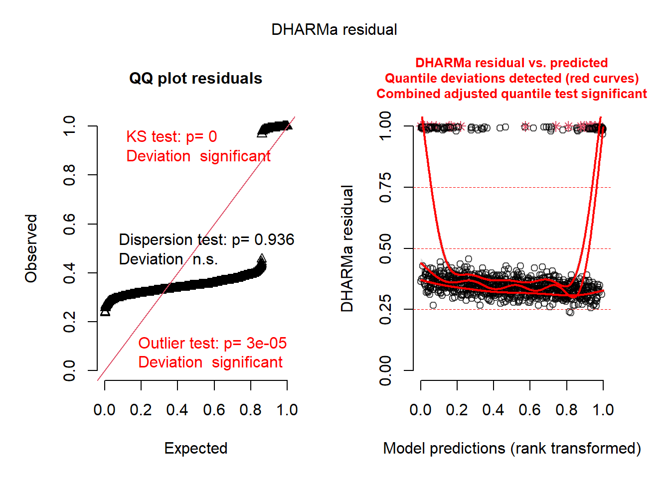
We see a very similar problem. The snakes show up in the QQ plot on the left again. The right plot also suggests there may be some nonlinearity, but its hard to know given this model is clearly mis-specified in terms of the assumed distribution. So now we can move to a logistic model and see if it changes, and we stick to DHARMa since OLS residuals clearly don’t work for most GLMs.
#### Fit Logistic Regression ####
fit.glm <- glm(
  formula = quit ~ years,
  data = df.logistic,
  family = binomial
)

#### Check Residuals ####
sim.glm <- simulateResiduals(fit.glm)
plot(sim.glm)
Warning in newton(lsp = lsp, X = G$X, y = G$y, Eb = G$Eb, UrS = G$UrS, L = G$L,
: Fitting terminated with step failure - check results carefully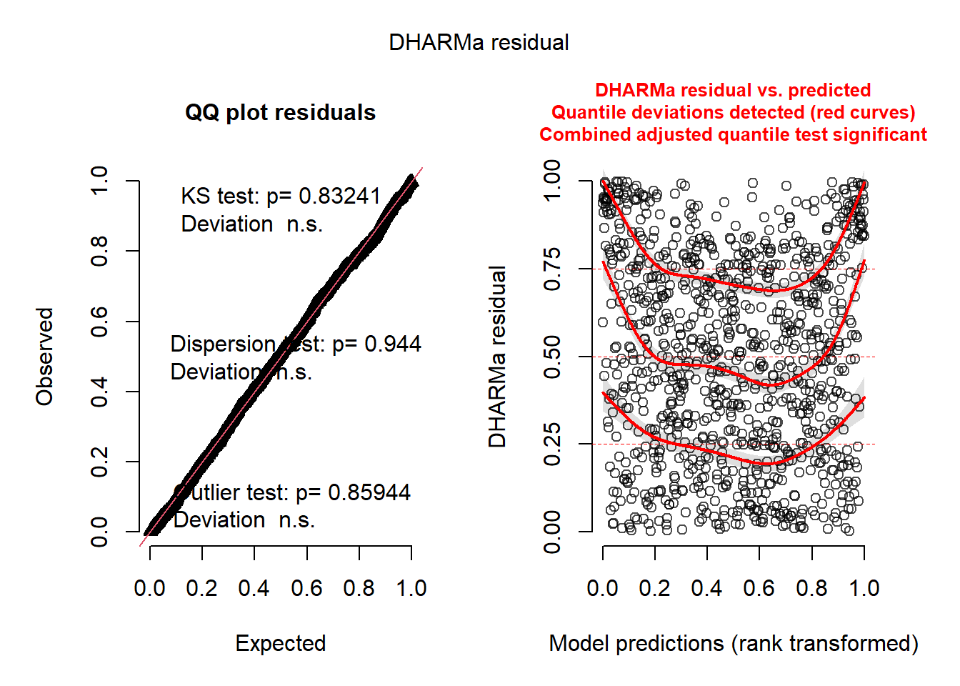
We see now that the QQ line looks a lot better. The right plot looks better in terms of the dispersion of dots, but there are still obvious patterns which convey that the model is mis-specified. So from here, we will run a generalized additive model (GAM, Wood, 2017), which will automatically fit nonlinear associations more flexibly. The gam() function works similarly to glm() and glmer(). The major difference in this function is the s() function used in the formula, which fits a spline for nonlinear associations.
#### Fit GAM ####
fit.gam <- gam(
  quit ~ s(years, bs = "tp"), # TP regression spline for nonlinearity
  data = df.logistic,
  family = binomial,
  method = "REML" # recommended against default GCV
)

#### Check Residuals ####
sim.gam <- simulateResiduals(fit.gam)
plot(sim.gam)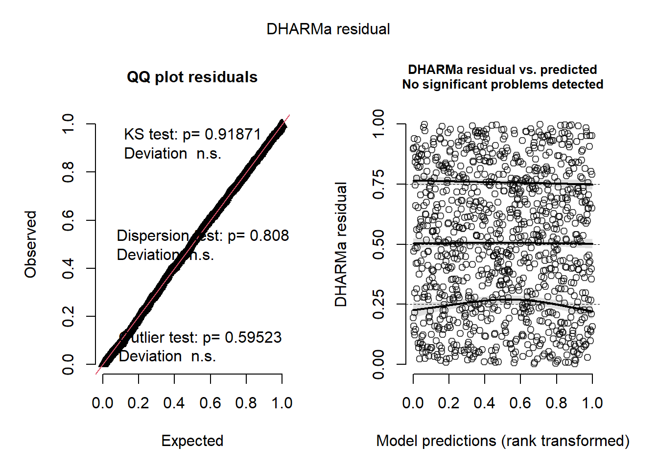
Our model is clearly much healthier now. We can visualize the relationship with some tidyverse functions.
df.logistic %>%
  ggplot(
    aes(years,quit)
  )+
  geom_jitter(
    color = "gray",
    height = .01,
    size = 5
  )+
  stat_smooth(
    method = "gam",
    color = "black",
    method.args = list(family = binomial),
    formula = y ~ s(x, bs = "tp")
  )+
  labs(
    x = "Years at Job",
    y = "Probability of Decision to Stay",
    title = "Logistic GAM of Simulated Data"
  )
Simulation 5: Fitting a Count Model with Random Effects (GLMM)
As DHARMa residuals are especially helpful for GLMMs, we will showcase an example here. For brevity, we will keep this simulation basic by using some convenient simulation code from the faux package to construct the data. Suppose we think that the number of past stressors someone has predicts their future stressors (which are both counts and therefore Poisson-distributed). However, we sample data from about 10 neighborhoods, which introduces some non-independence in our data. We can produce this example below:
#### Create Basic Data ####
set.seed(123)
x <- rpois(100,5) # Poisson-distributed predictor
y <- .001 + .15*x # linear predictor of response before transformation
df.original <- data.frame(x, y)

#### Transform to Mixed Model Data ####
df.pois <- df.original %>%
  add_random(
    neighborhood = rep(
      1:10,
      length.out = nrow(df.original)
      )
    ) %>% # adds 10 neighborhoods to data
  add_ranef("neighborhood", u0 = .5) %>%  # neighborhood RE intercept = .5
  mutate(
    past_stressors = x, # rename predictor
    lambda = exp(y + u0), # define lambda for response
    current_stressors = rpois(nrow(.), lambda), # create Poisson response
    neighborhood = factor(neighborhood) # transform RE to factor
  ) %>%
  select(
    past_stressors,
    current_stressors,
    neighborhood
  ) # select only relevant variables

#### Print Data ####
glimpse(df.pois)
Rows: 120
Columns: 3
$ past_stressors <int> 0, 0, 0, 0, 0, 0, 0, 0, 0, 0, 1, 1, 1, 1, 1, 1, 1, 1…
$ current_stressors <int> 1, 0, 0, 1, 0, 6, 0, 0, 0, 1, 1, 3, 1, 3, 1, 3, 1, 2…
$ neighborhood <fct> 1, 2, 3, 4, 5, 6, 7, 8, 9, 10, 1, 2, 3, 4, 5, 6, 7, …We can see that the Poisson-distributed data has a lot of zeroes and of course because it is count data all of the values are non-negative. This of course would necessitate stepping away from a Gaussian model and attempting at least a Poisson GLMM instead. First, let’s visualize the data with some tidyverse code.
#### Plot Data ####
df.pois %>%
  ggplot(
    aes(
      x = past_stressors,
      y = current_stressors
    )
  )+
  geom_point(color = "gray", size = 5)+
  scale_y_continuous(n.breaks = 10)+
  facet_wrap(~neighborhood, nrow = 2)+
  stat_smooth(
    method = "glm",
    color = "black",
    method.args = list(family = poisson)
  )+
  labs(
    x = "Past Stressors",
    y = "Current Stressors",
    title = "Neighborhood Differences in Stressors"
  )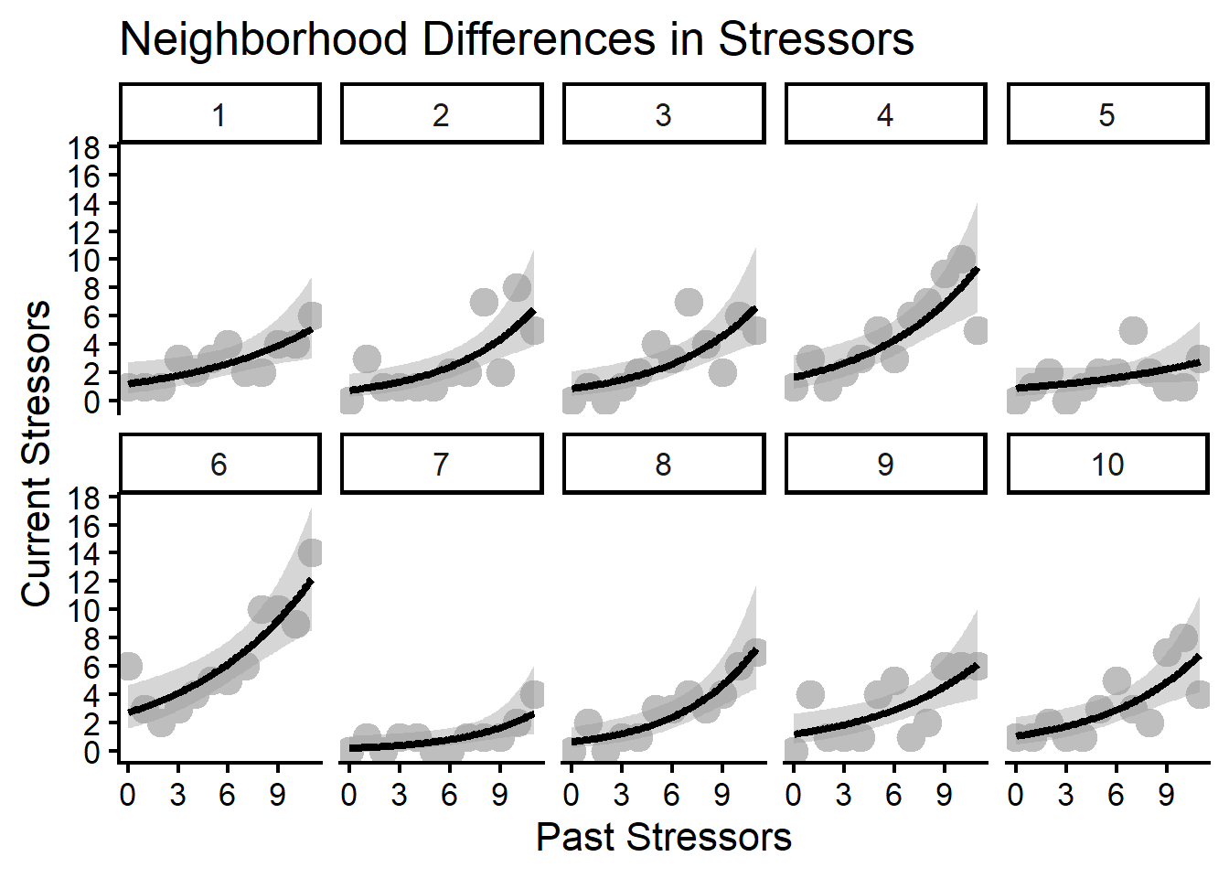
This shows some typical Poisson relationships between stressors. Though the intercepts vary and the magnitude of the slope varies some, the direction of the effect is similar across all neighborhoods. We will first fit a “wrong” model by not accounting for this random effect variation and instead using a standard Poisson GLM first. Then we will check the DHARMa residuals and see how it fares.
#### Fit GLM ####
fit.pois.glm <- glm(
  current_stressors ~ past_stressors,
  data = df.pois,
  family = poisson
)

#### Get DHARMa Residuals ####
sim.pois.1 <- simulateResiduals(fit.pois.glm)
plot(sim.pois.1)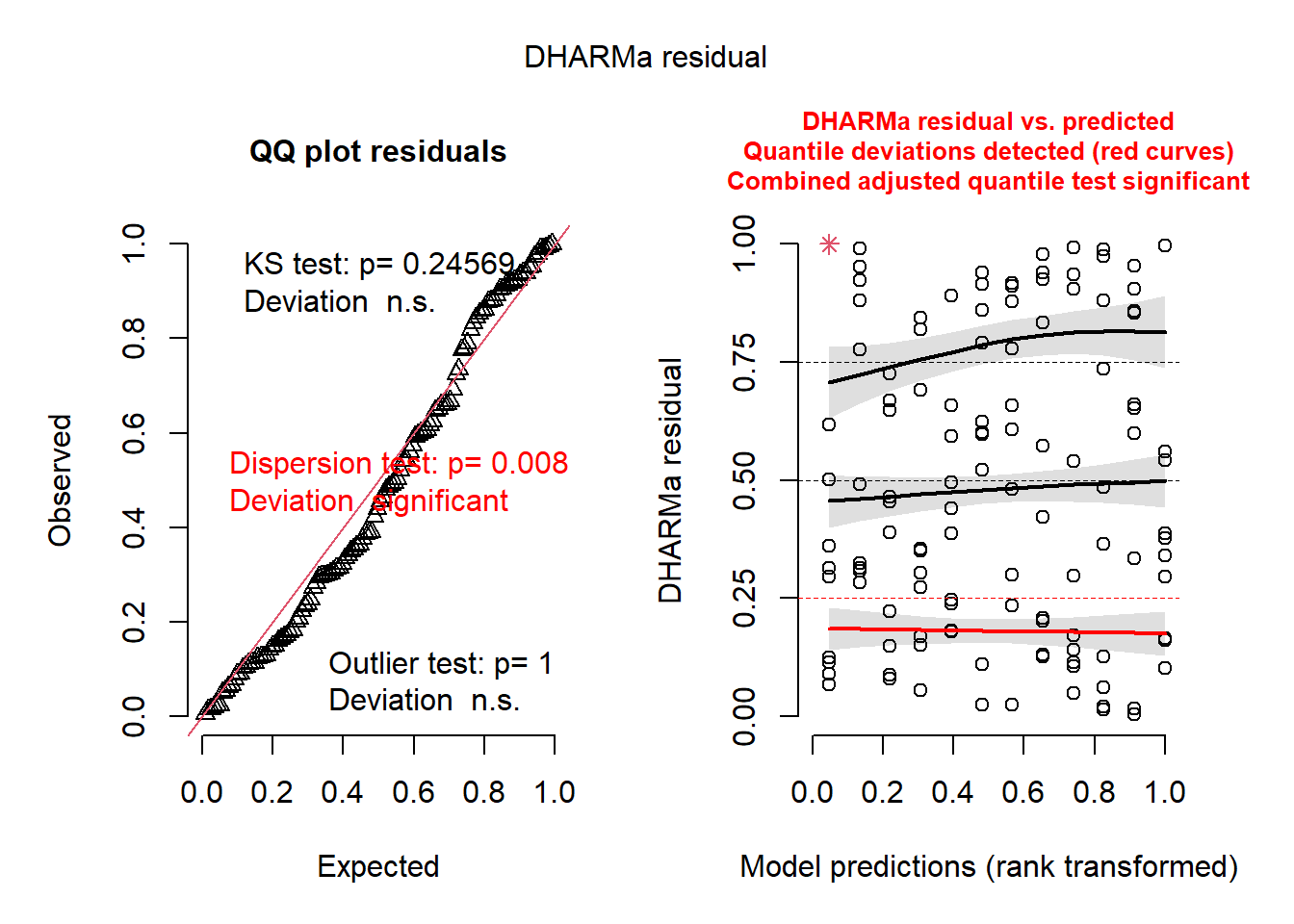
The residuals look neither great nor terrible. Let’s see what happens with a GLMM.
#### Fit GLMM ####
fit.pois.glmm <- glmer(
  current_stressors ~ past_stressors + (1|neighborhood),
  data = df.pois,
  family = poisson
)

#### Get Residuals Again ####
sim.pois.2 <- simulateResiduals(fit.pois.glmm)
plot(sim.pois.2)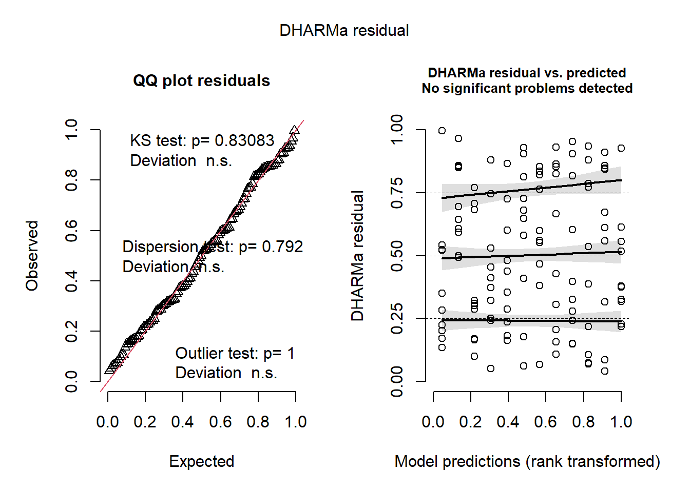
Here we see some improvement. Since we already know there is variation by neighborhood, this may be the more appropriate model.
Simulation 6: Predicting a Non-Normal Continuous Response
Reaction time (RT) data is often right-skewed and is a poor fit for Gaussian models like OLS (see Real Data section for a practical example). Let’s simulate reaction times from subjects. In this scenario, we will pretend they were allowed to complete as many tasks (trials) as they felt until they felt they could no longer perform. It is assumed that more trials will produce slower reactions. As before, we will use a linear predictor to estimate the response, using an exponential relationship to approximate the relationship between the response and predictor.
#### Setup ####
set.seed(123)
n.gamma <- 500
trials <- rpois(n.gamma,20)

#### Create Parameters for Gamma ####
mu <- exp(3 + .1 * trials)   # mean grows with x
shape <- 10                     # higher = less skew
scale <- mu / shape             # ensures mean = mu

#### Simulate Gamma Response ####
rt <- rgamma(n.gamma, shape = shape, scale = scale)

#### Merge Data ####
rt.data <- data.frame(trials, rt)
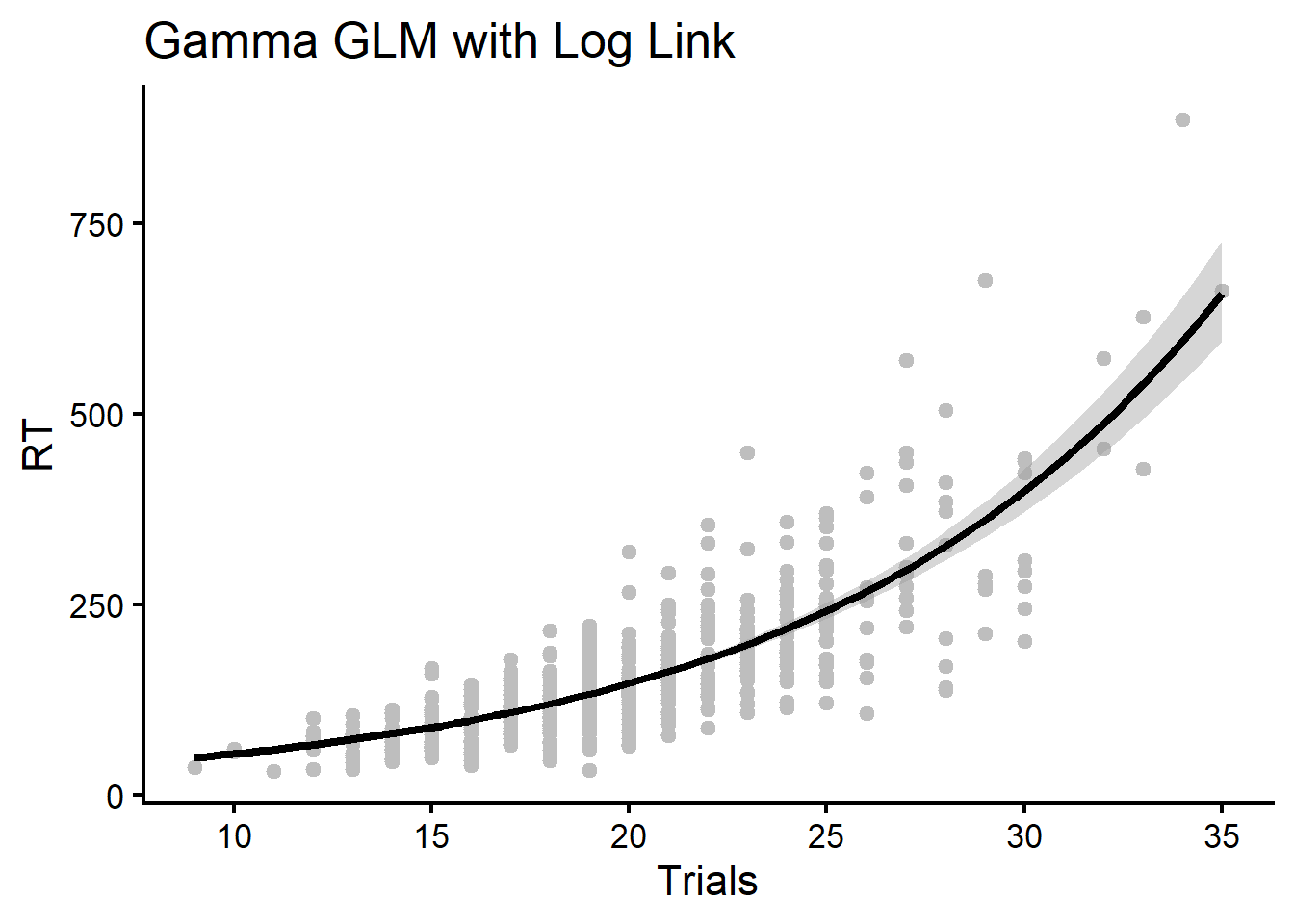
We can visualize two Gamma GLMs, one with a log link function and one with an inverse link function (the default). First the log link:
#### Visualize First Model ####
rt.data %>%
  ggplot(
    aes(
      x = trials,
      y = rt
    )
  )+
  geom_point(color = "gray")+
  stat_smooth(
    color = "black",
    method = "glm",
    method.args = list(family = Gamma(link = "log"))
  )+
  labs(
    x = "Trials",
    y = "RT",
    title = "Gamma GLM with Log Link"
  )
And the inverse link below:
#### Visualize Second Model ####
rt.data %>%
  ggplot(
    aes(
      x = trials,
      y = rt
    )
  )+
  geom_point(color = "gray")+
  stat_smooth(
    color = "black",
    method = "glm",
    method.args = list(family = Gamma(link = "inverse"))
  )+
  labs(
    x = "Trials",
    y = "RT",
    title = "Gamma GLM with Inverse Link"
  )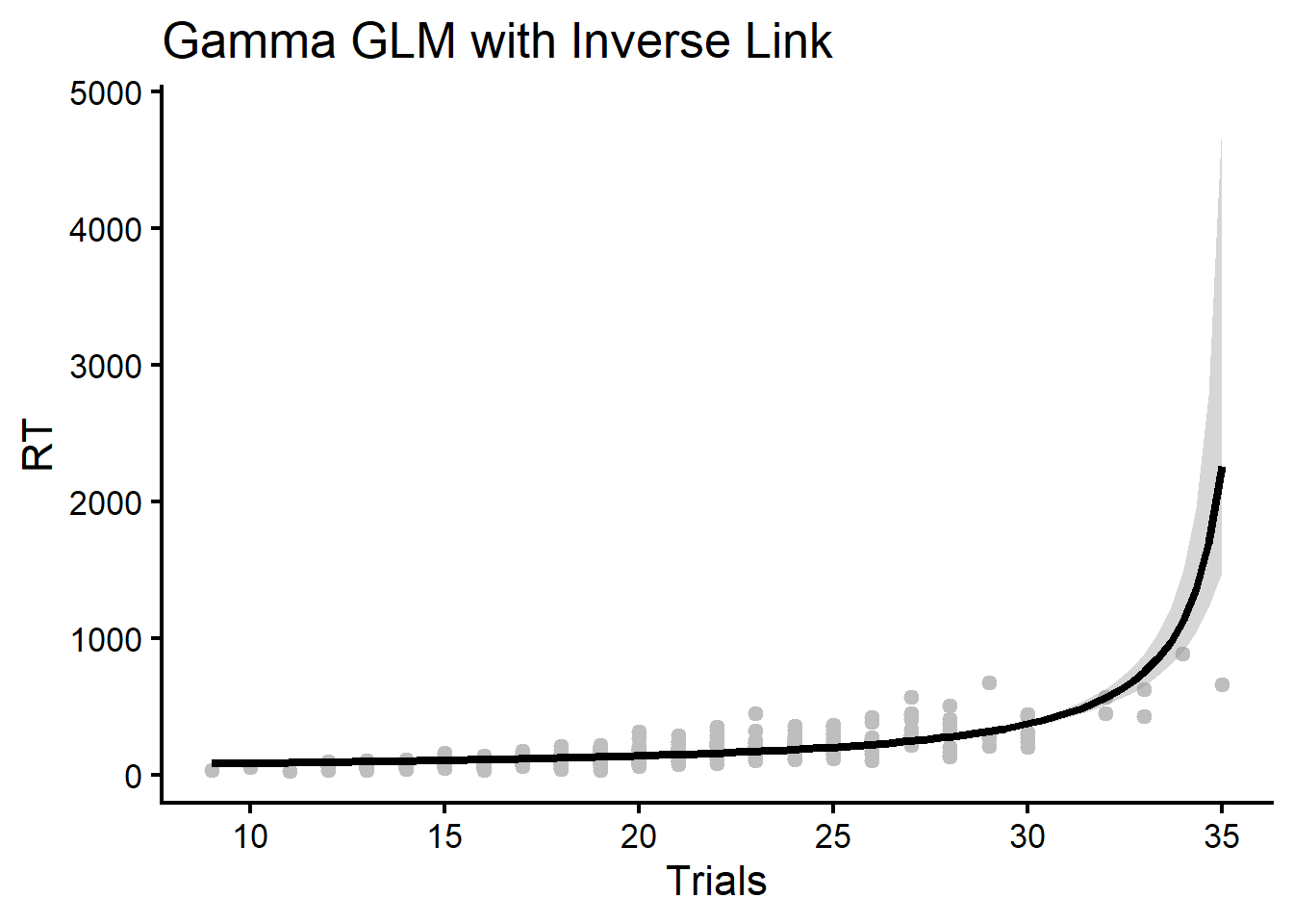
Though the models are very similar, we can see the inverse link estimates a sharper upward curve with extreme confidence intervals (notice the RT values scale up to the 1000s). We will see which model fits the response better using DHARMa. First, we fit the complimentary models.
#### Fit Gamma GLM ####
fit.gamma.log <- glm(
  rt ~ trials,
  family = Gamma(link = "log"), # use log link function
  data = rt.data
  )

#### Refit Using Inverse ####
fit.gamma.inv <- glm(
  rt ~ trials,
  family = Gamma(link = "inverse"), # use inverse link function
  data = rt.data
)
We first check the log link model:
plot(simulateResiduals(fit.gamma.log))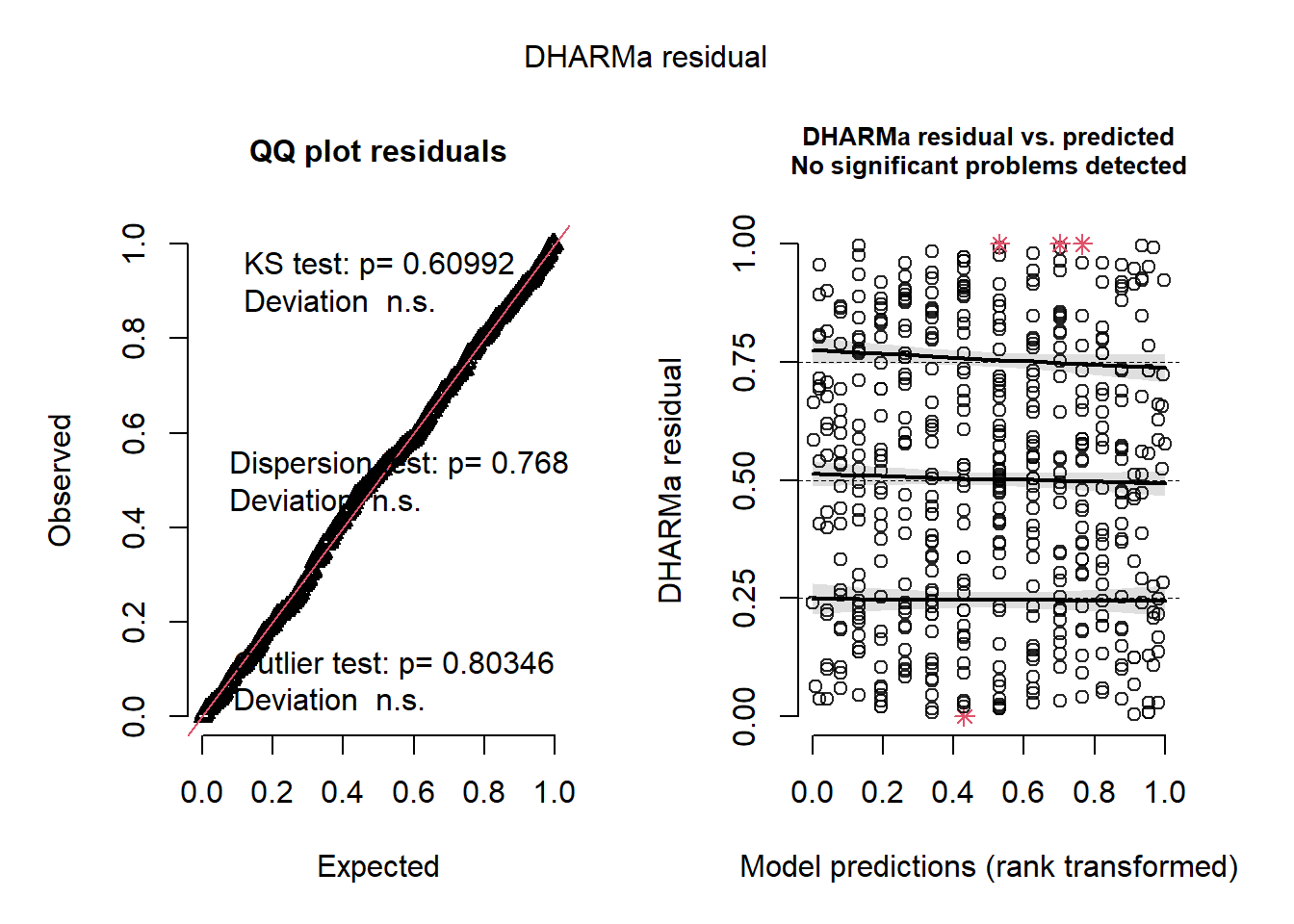
Though there appear to be some outliers (indicated by the red stars), and some slight curvature at the upper quantile of the distribution, the model overall seems okay. What about the inverse?
plot(simulateResiduals(fit.gamma.inv))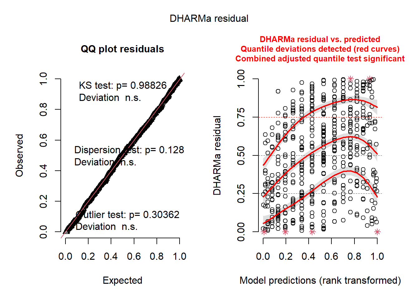
Here the curvature is more dramatic and suggests the inverse is not as good a fit. To a degree, we should have expected this given the way we simulated the response (with an exponential rather than an inverse relationship).
Using DHARMa Functions to Simulate Data
The previous sections showed that you can simulate virtually anything you want in R. This allows you to build inference about how models should behave and how residuals can detect mis-specification. However, the previous sections also highlight that this requires a lot of tedious coding that at times may be unnecessary.
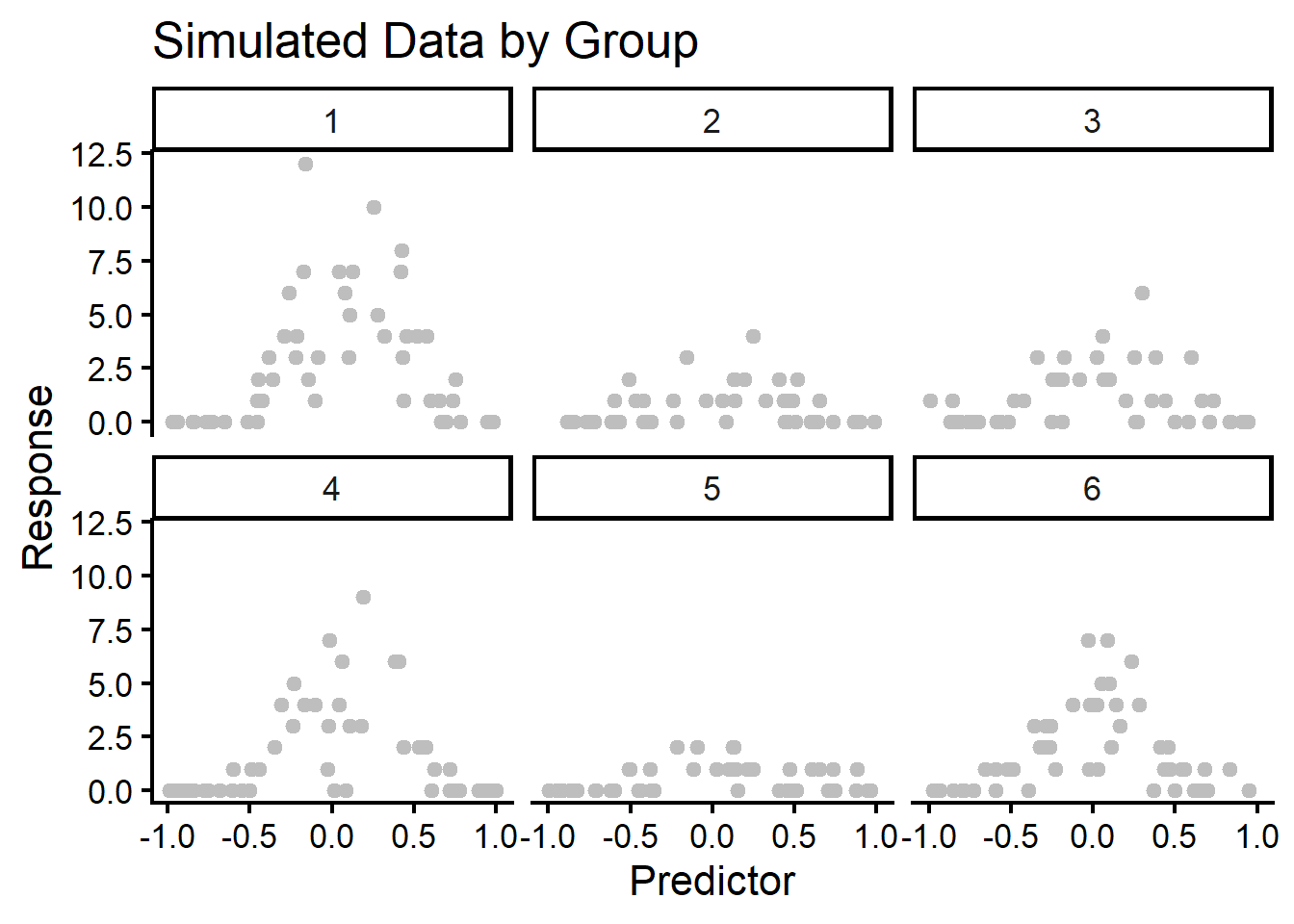
One really cool part about DHARMa is that you can easily simulate a lot of types of data yourself with very minimal code. The helper function for this is the createData() function, which has many examples in the original DHARMa vignette (Hartig, 2017). Here we create some data that has 6 groups that produce some random effect variance for a Poisson-distributed response. There is also a quadratic (nonlinear) association added to the data. Note by default that this function creates a default predictor called “Environment1” and a default response called “observedResponse”. The groups are unambiguously created as “group”. Inspecting the data with glimpse() shows the reproduced data.
#### Set Random Seed ####
set.seed(123)

#### Create Data ####
messy.data <- createData(
  sampleSize = 300,
  intercept = 1,
  fixedEffects = 1,
  quadraticFixedEffects = -5,
  family = poisson(),
  randomEffectVariance = 1,
  numGroups = 6
  )

#### Inspect Data ####
glimpse(messy.data)
Rows: 300
Columns: 7
$ ID <int> 1, 2, 3, 4, 5, 6, 7, 8, 9, 10, 11, 12, 13, 14, 15, 16…
$ observedResponse <int> 2, 1, 0, 1, 3, 7, 0, 0, 3, 0, 1, 0, 7, 1, 0, 6, 5, 2,…
$ Environment1 <dbl> -0.14622885, -0.10453980, 0.66658954, 0.43917457, -0.…
$ group <fct> 1, 1, 1, 1, 1, 1, 1, 1, 1, 1, 1, 1, 1, 1, 1, 1, 1, 1,…
$ time <int> 179, 14, 195, 118, 229, 244, 299, 153, 90, 91, 256, 1…
$ x <dbl> 0.09944582, 0.16116576, 0.28299287, 0.58387234, 0.731…
$ y <dbl> 0.322385552, 0.001191628, 0.992170619, 0.148352392, 0…Visualizing this data before fitting should show some oddities in the data.
messy.data %>%
  ggplot(
    aes(
      x = Environment1,
      y = observedResponse
    )
  )+
  geom_point(color = "gray")+
  facet_wrap(~group)+
  labs(
    x = "Predictor",
    y = "Response",
    title = "Simulated Data by Group"
  )
We can fit this model with a wrong GLM that misses the nonlinear assocation and random effect variance.
#### Fit Model ####
fit.poisson.wrong <- glm(
  formula = observedResponse ~ Environment1,
  data = messy.data,
  family = poisson()
)

#### Check Residuals ####
sim <- simulateResiduals(fit.poisson.wrong)
plot(sim)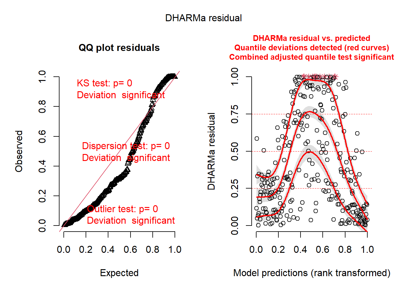
We can clearly see the data is mis-specified based on the DHARMa residuals. Refitting to a generalized additive mixed model (GAMM, Wood, 2017) may be beneficial here.
fit.final.model <- gam(
  formula = observedResponse ~ s(Environment1) + s(group, bs = "re"),
  data = messy.data,
  family = poisson(),
  method = "REML"
)

sim.final <- simulateResiduals(fit.final.model)
plot(sim.final)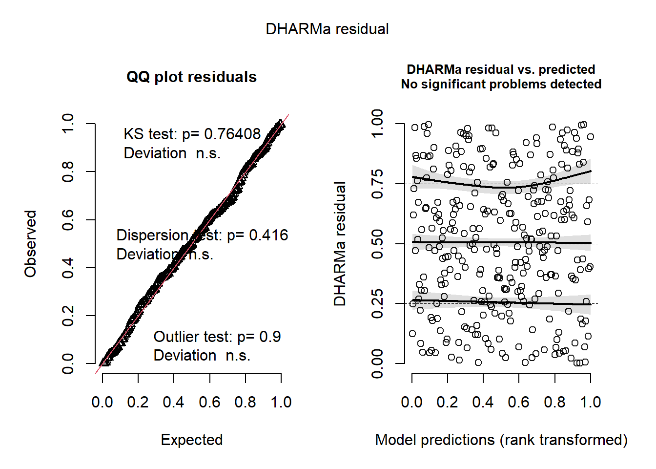
We see now that our model has substantially improved.
References
Hartig, F. (2017). DHARMa: Residual diagnostics for hierarchical (multi-level/mixed) regression models. https://cran.r-project.org/web/packages/DHARMa/vignettes/DHARMa.html
Long J.S., Ervin L.H. (2000). Using heteroscedasticity consistent standard errors in the linear regression model. The American Statistician, 54, 217–224. http://dx.doi.org/10.1080/00031305.2000.10474549
Shatz, I. (2024). Assumption-checking rather than (just) testing: The importance of visualization and effect size in statistical diagnostics. Behavior Research Methods, 56(2), 826–845. https://doi.org/10.3758/s13428-023-02072-x
Westfall, P.H., & Arias, A.L. (2020). Understanding regression analysis: A conditional distribution approach. CRC Press, Taylor & Francis Group.
Wood, S.N. (2017). Generalized additive models: An introduction with R (2nd ed.). CRC Press, Taylor and Francis Group.