#### Specify Packages to Load ####
pkgs <- c(
  "DHARMa", "tidyverse",
  "qgam", "MKpower"
  )

#### Install Packages ####
install.packages(pkgs)What is DHARMa?
The 3 Major Steps Behind DHARMa Residuals
According to the package creator, DHARMa stands for “Diagnostics for HierArchical Regression Models”. The package was originally designed for assessing the fit of generalized linear models (Hartig, 2017). The scope of the package has expanded greatly, as it can accommodate many types of models, including generalized additive models (GAMs), phylogenetic linear models (PLMs), and even Bayesian models (with some tinkering of code).
The principle behind DHARMa is quite elegant. The 3 major steps are outlined by the package creator here. Those steps are:
Simulate the response from a fitted model for each observation used.
Build an empirical CDF around the simulated values.
Scale the residuals so that they are usable across generalized models.
If that is confusing, I will break this down in the following sections for social scientists who have no training in model criticism. Note that some of the following sections may be quite verbose. If you are interesting in just learning the “meat and potatoes” of each section, I recommend reading the “Major Takeaway” sections for each step.
To run the code below, you will need to install the following packages:
And then simply load the packages once they are installed.
#### Load Packages ####
library(DHARMa) # for DHARMa residuals
library(qgam) # install if not already
library(tidyverse) # plotting and wrangling functions
library(MKpower) # for uniform QQ plots with 95% CIs

#### Set Plotting Theme ####
set_theme(theme_classic(base_size = 16))
Step 1: Simulating the Response
Basics of Simulation
We can simulate almost anything we want in science (within reason). For example, I may simulate a set of ages of students which I assume to have a mean of 18 years old by simply creating a row or column of data which looks like what I would expect. In this case, if I think a study I have will have an average age of 18 and only fluctuate a little from that mean, then I can just use a lot of values of “18” and spread some points around that to make a normal distribution.
age <- c(13,14,15,16,16,18,18,18,18,18,18,18,18,19,19,20,21,22,23)
mean(age)
[1] 18hist(age)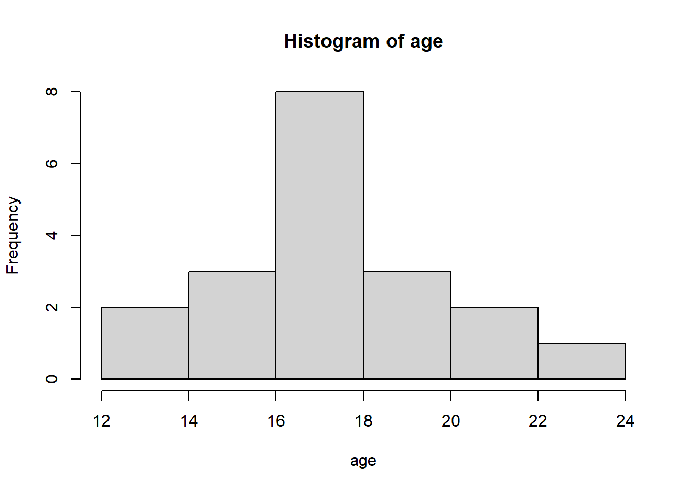
However, we can automate this in R if we already know the parameters we are interested in. For example, if I want to simulate a normal distribution that encompasses ages like those above, I can use the rnorm() function. It has 3 principle arguments:
n= The number of observations of the variable.mean= The mean of the variable.sd= The standard deviation (SD) of the variable.
To demonstrate, I will now simulate ages with a mean of 18 and a SD of 5. I set a random seed at the beginning so this simulation can be replicated. I also round the scores so they are discrete (because ages that are countable do not have decimals).
#### Set Random Seed ####
set.seed(123)

#### Simulate Age ####
age.sim <- round(
  rnorm(
    n = 20,
    mean = 18,
    sd = 5
    )
)

#### Visualize Age ####
hist(
  age.sim,
  xlab = "Age",
  main = "Histogram of Age"
)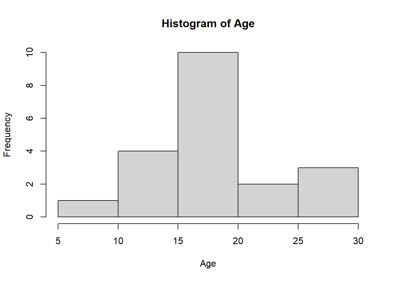
We see that it approximated a similar range of values based on what I specified.
Simulating a Linear Equation
The interesting thing is that we can technically recreate linear equations to simulate real data processes (see multiple examples in Westfall & Arias, 2020 and the “Simulated Data” section of this website). For instance, suppose we think that IQ is predicted by age with the following linear equation:
\[ \text{IQ} = 10 + \text{(5 x Age)} + \epsilon \]
This equation says the following:
- The baseline guess is about 10 IQ without considering any predictors in the model. This is of course a silly guess since most people wouldn’t be measured on their IQ at 0 years old. So this “conditional mean” is adjusted by the predictors in the model to make predictions.
- Age increases IQ by 5 points for every 1 year increase in age. So if the baseline IQ is 10 and their age is 20, then their predicted IQ would be \(10 + (5 \times 20) = 110\) according to our equation.
- Everything else is leftover (the “e” looking letter at the end of the equation).
We can simulate such a relationship and fit a model to see if it approximates that relationship well. Below I simulate this data with \(n = 5000\) participants.
set.seed(123)
age <- round(rnorm(n = 5000, mean = 18, sd = 5))
iq <- round(10 + 5*age + rnorm(5000, sd = 10))
df.iq <- data.frame(age,iq)
We can inspect what the values look like below using the head() function to get the first 5 rows.
head(df.iq, 5) age iq
1 15 80
2 17 106
3 26 129
4 18 115
5 19 114As I mentioned before, age and IQ are continuous here, but for simplicity we will stick with this data. They at least have the ranges of values we would expect based on our simulation. Plotting the data will make the relationship more clear.
plot(age,iq)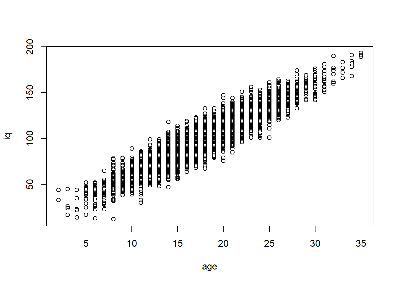
We see there is a positive association. Fitting the model will show the intercept and slope are very similar to what we simulated (see the “Coefficients” section below).
fit <- lm(formula = iq ~ age, data = df.iq)
summary(fit)
Call:
lm(formula = iq ~ age, data = df.iq)

Residuals:
    Min      1Q  Median      3Q     Max
-38.061  -6.938   0.021   7.021  38.001

Coefficients:
            Estimate Std. Error t value Pr(>|t|)
(Intercept) 10.14354    0.53201   19.07   <2e-16 ***
age          4.98970    0.02849  175.14   <2e-16 ***
---
Signif. codes:  0 '***' 0.001 '**' 0.01 '*' 0.05 '.' 0.1 ' ' 1

Residual standard error: 10.03 on 4998 degrees of freedom
Multiple R-squared:  0.8599,    Adjusted R-squared:  0.8599
F-statistic: 3.067e+04 on 1 and 4998 DF,  p-value: < 2.2e-16
More examples like this are given in the “Simulated Data” section of this website.
Simulating From a Model
We can assess how well a model emulates a response by using the model itself (see Chapter 11 of Gelman et al., 2022 for examples). Since we have the parameters estimated by the model already, the model can now randomly generate data based on these parameters. There is a practical way of thinking about this. Suppose you have a recipe for making an omelette. You know that you normally need 3 eggs, a 1/4 cup of meat, a 1/8 cup of cheese, and other ingredients. Somebody else can directly do the same with these instructions, but there will always be some random variation / error (for example, the size of eggs will sometimes differ). We can think of this a bit like a linear equation such as the one estimated by our above model:
\[ \text{Omelette = 3 Eggs + 1/4 Cup of Meat + 1/8 Cup of Cheese + Error} \]
Simulating from the model is a bit like getting somebody else to reproduce our omelette. They may be able to reproduce the omelette with the instructions but depending on the model-generating process (e.g. how much error there is), there will always be some level of imprecision from this process. Doing this many times, however, will remove some of this uncertainty, which is partly what DHARMa does for creating residuals.
We can directly simulate what the distribution of the response would look like assuming our above model with the simulate() function in R. This does a similar thing as our rnorm() function but it instead uses the regression equation to simulate the response. It will give us back exactly \(n = 5,000\) observations just like our model originally had.
#### Simulate Response From Model ####
sim.basic <- simulate(fit)

#### Draw Histogram of the 5,000 Simulated Observations ####
hist(
  x = sim.basic$sim_1,
  main = "One Simulation From Our Model (n = 5,000)",
  xlab = "Simulated IQ Values"
  )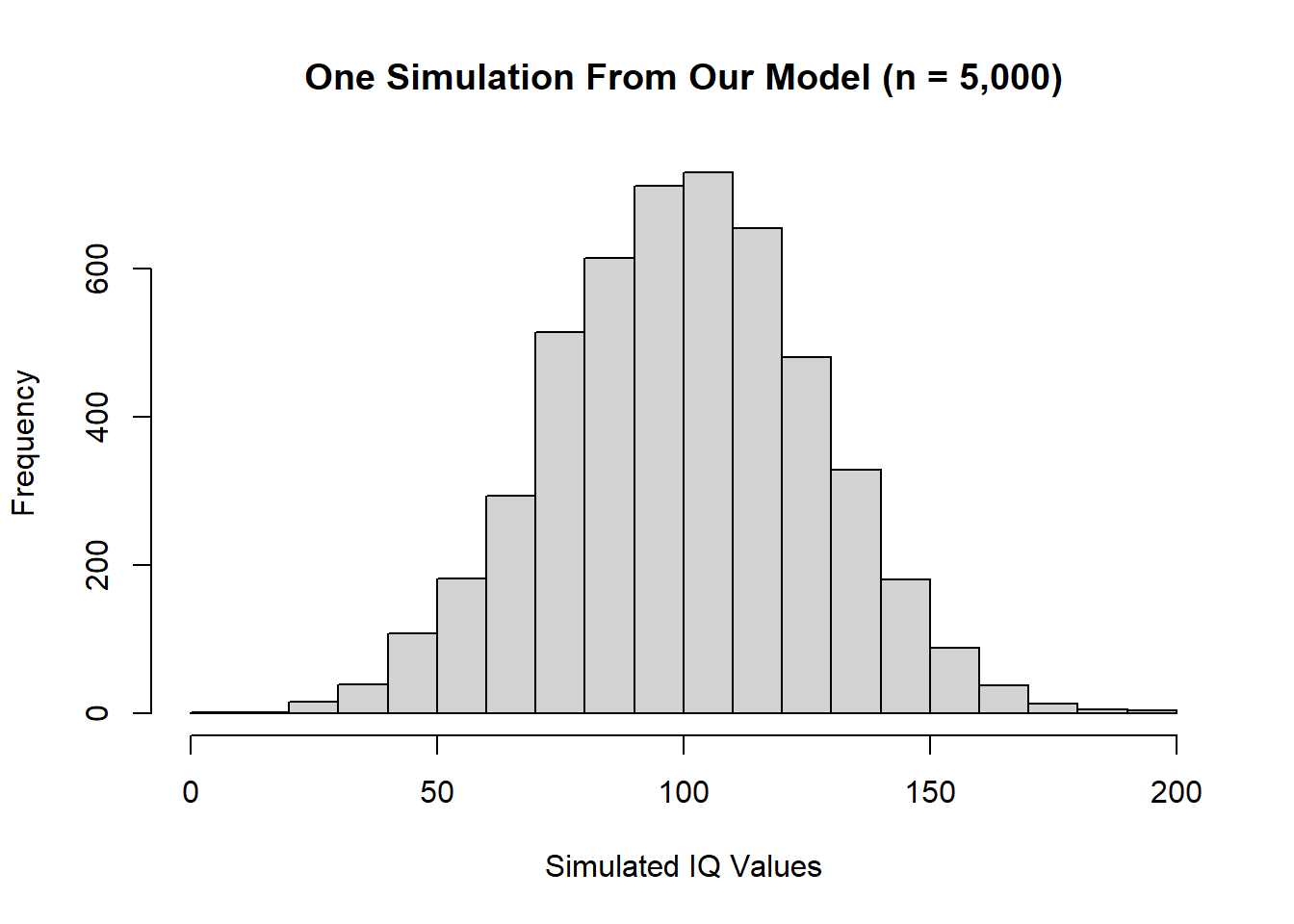
We can see the IQ scores center around 100 and deviate around that, which captures what we would expect with IQ scores. Now that we have covered this ground, the first step in estimating DHARMa residuals is essentially doing what we accomplished here, only doing it multiple times. The default in DHARMa is to do this 250 times in a row. This is easily achievable ourselves by simply adding nsim = 250 in our previous function and saving that into an object called all.sims.
#### Simulate ####
all.sims <- simulate(fit, nsim = 250)
To visualize what this looks like, I select the first 6 simulations and plot histograms of each using some tidyverse code.
#### Pivot Simulations to Long Format Data ####
tidy_sim <- all.sims[1:6] %>%
  pivot_longer(
    cols = starts_with("sim"),
    names_to = "sim",
    values_to = "iq"
  )

#### Visualize Six Simulations ####
tidy_sim %>%
  ggplot(
    aes(
      x = iq
    )
  )+
  geom_histogram(color = "white")+
  facet_wrap(~sim)+
  labs(
    x = "IQ",
    y = "Count",
    title = "Six Simulations From OLS Model"
  )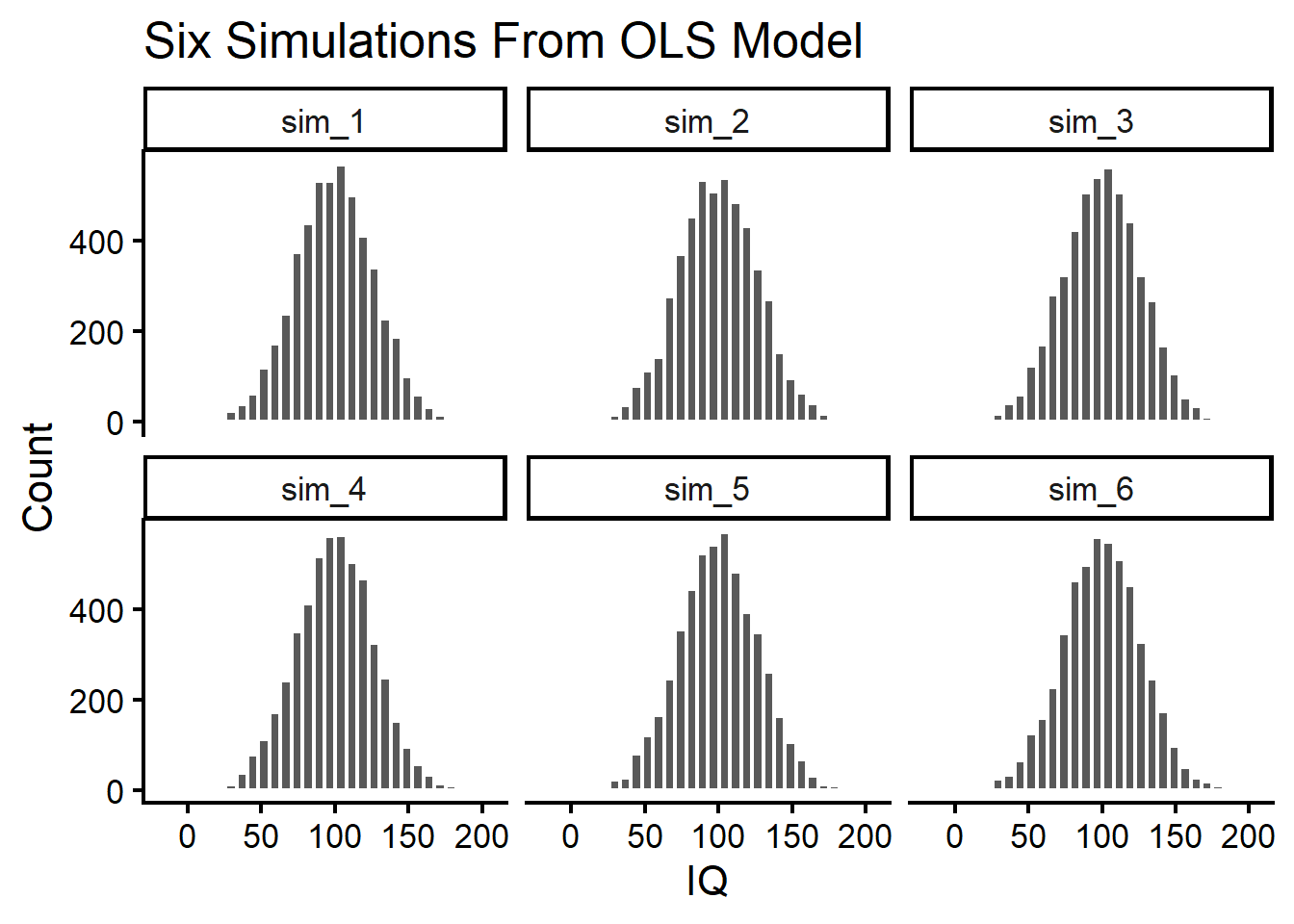
We can see that while there are some differences in their distributions, they are very similar to each other (beyond some sampling variation).
Major Takeaway From Step 1
Simulations allow us to recreate what we envision a data-generating process to be. We can do this in a very simple way (literally creating the data by-hand ourselves) or we can use models to recreate the data (using something like simulate() in R).
DHARMa does almost exactly the same thing we did here for the first step of creating the residuals. Internally, it uses an initial function called getSimulations(). This is a wrapper function around simulation() that allows you to do what we just did. It also allows you to perform a refitted version of the same thing (which is sometimes necessary for discrete responses). Otherwise there are no major differences between what we did and what DHARMa does when first estimating the residuals. Therefore, if you understand what we did with simulation(), you already understand Step 1 of estimating DHARMa residuals.
Step 2: Translating the Simulated Response to the CDF
The Empirical Cumulative Distribution Function in a Nutshell
To reproduce the residuals for a Gaussian response, we wouldn’t need to take any extra steps here to approximate the distribution. However, the intent of DHARMa is to translate this process to as many models as possible using a generalized approach. So how do distributions like Gaussian, Bernoulli, Poisson, and others share similarities? One way is through their empirical cumulative density function (CDF), which is always limited to a range from 0 to 1.
As a reminder, the empirical CDF tries to answer the following question: “What proportion of data points are equal to or below \(t\)?”. The formula for the ECDF is:
\[ F_n(t) = \frac{1}{n} \sum_{i=1}^n I(x_i \leq t) \] But in human words it can be expressed simply as:
\[ F_n(t) = \frac{\text{Total number of values where } {x_i \leq} \text{ some cutoff}}{\text{Total number of values}} \] This essentially says that, to calculate a given data point \(t\)’s ECDF (for example IQ = 100), we just have to sum all of the values that are equal to or below \(t\), then divide by the total number of values. To keep things simple, let’s envision we collected a very small sample of IQ scores.
iq <- c(90,100,100,100,100,130,140,150,160,170)One quick way of getting the ECDF is by using the ecdf function. By plugging iq into this function, we get back a function that allows us to estimate the number of values that are equal to or below it:
ecdf_fun <- ecdf(iq)Now we can estimate how many values are below a certain threshold. Maybe we want to know how many people in this sample have an IQ below 100. This could be calculated easy now with our ecdf_fun() function.
ecdf_fun(100)[1] 0.5We can check this by seeing that the first 5 of the 10 IQ scores in our sample have an IQ equal to or below 100. Using our previous equation, we can work this out ourselves without help from R:
\[
F_n(t) = \frac{\Sigma{(\text{IQ < 100})}}{\text{10}} = \frac{5}{10} = .5
\] To show what ecdf() is doing, we can create our own function to emulate what it is doing by just adding in all the parts that we had from our earlier formula:
#### Create a Function for ECDF ####
ecdf_manual <- function(t, data) {
  n <- length(data) # total # of scores
  result <- sum(data <= t) / n # proportion of total
  return(result) # return result
}

#### Estimate ECDF of 100 ####
ecdf_manual(100, iq)
[1] 0.5You will notice that we get back the same number from this function as the ecdf_fun() we had before. In any case, we can visualize our ECDF that was calculated for us by using plot() on our previous ecdf_fun() object.
plot(ecdf_fun, main = "ECDF of IQ")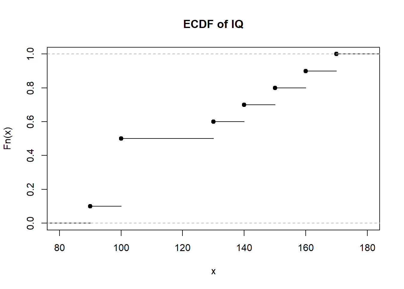
The ECDF works like a step-function. The dots are where certain values in our distribution lie and the trailing lines are the step to the next value. For example, the first dot on the bottom starts at IQ = 90 and the line is drawn until it reaches IQ = 100. Notice that when IQ = 100, the estimated proportion of values below or equal to 100 is around 50% like we observed earlier.
A Quick Detour to Interpolation
Before we learn how to generalize the ECDF to non-normal distributions, we may need to review linear interpolation first. We have to do this because interpolation is important for creating an ECDF for non-Gaussian distributions, and this is done because of this step-function property we outlined earlier. Therefore, we briefly review interpolation here before discussing DHARMa’s version of an ECDF.
To begin, linear interpolation is the process of estimating an unknown point between two (or more) known points. This is useful when we know some points on a scatterplot but we want to guess some other points that lie between them. The basic formula for interpolation of two points is:
\[ y = y_1 + \frac{(x - x_1)(y_2 - y_1)}{(x_2 - x_1)} \] Here are the pieces in the formula:
- \(y\) is the unknown point we are trying to estimate
- \(x_1\) and \(y_1\) are the coordinates of the first known point in a line
- \(x_2\) and \(y_2\) are the coordinates of the second known point in a line
- \(x\) is the point we are interested in estimating \(y\) with
This may sound a bit abstract, so let’s use an example. Suppose we have two coordinates on a scatterplot. The first is \((1,3)\) and the other is \((5,7)\). We can plot these two points below:
plot(
  x = c(1,5),
  y = c(3,7),
  pch = 19,
  cex = 3,
  xlab = "X",
  ylab = "Y",
  main = "Two Points"
)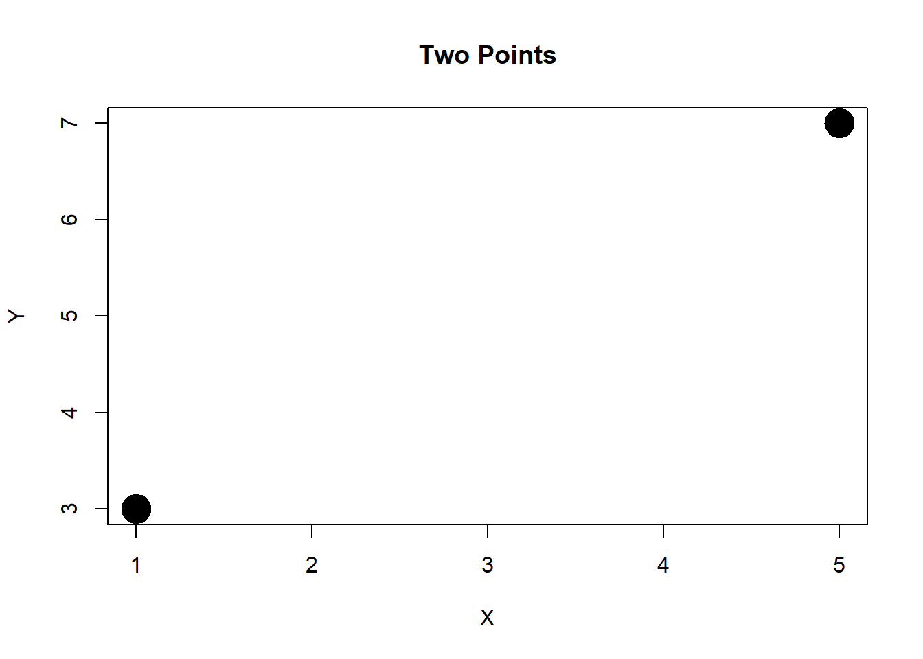
Based on our two coordinates, we want to know what \(y\) will be if \(x = 3\). Unfortunately, we don’t know this information, so we can interpolate using our formula, which we build into a crude function below.
#### Interpolation of Two Points ####
interp <- function(x,x1,x2,y1,y2){
  top <- (x - x1)*(y2 - y1)
  bottom <- (x2 - x1)
  y <- y1 + (top/bottom)
  return(y)
}

#### Calculate Y When X = 2 ####
i <- interp(
  x = 3,
  x1 = 1,
  x2 = 5,
  y1 = 3,
  y2 = 7
)

#### Print I ####
i
[1] 5We can now visualize this on our plot.
plot(
  x = c(1,5),
  y = c(3,7),
  pch = 19,
  cex = 3,
  xlab = "X",
  ylab = "Y",
  main = "Interpolation of Two Points"
)

points(x = 3, y = i, col = "steelblue", cex = 3)
lines(x = c(1,5), y = c(3,7), col = "steelblue", lwd = 3)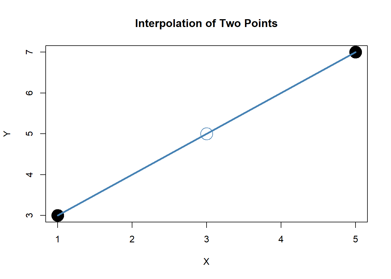
To automate this, we can use the approxfun() function in R instead of using our own function.
#### Create Interpolation Function ####
f <- approxfun(x = c(1, 5), y = c(3, 7))

#### Check Our Previous Value ####
f(3)
[1] 5This is interesting, but not entirely useful since we can probably just trace a line between \(x\) and \(y\) and estimate it by-hand from our scatterplot. This is a lot more useful when you have to estimate many points or have a nonlinear distribution of points. I provide an example now with \(x\) equal to 1 to 10 and a set of random \(y\) values. I ask R to automatically interpolate a default 50 points between these values. This will give an approximation of what the \(y\) values should be for a very complex association.
#### Create Multiple Points ####
set.seed(123)
n <- 15
x <- 1:n
y <- rnorm(n)

#### Plot Points ####
plot(
  x,
  y,
  cex = 3,
  pch = 19,
  main = "Interpolation of Multiple Points"
  )

#### Add Interpolated Points ####
points(
  approx(x, y),
  col = "steelblue",
  cex = 1.5
)

#### Add Interpolated Line ####
lines(
  approx(x, y),
  col = "steelblue",
  pch = "*",
  cex = 3,
  lwd = 3
  )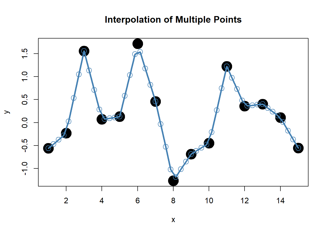
We can see this can be very useful if we have many unknowns to estimate.
Constructing a Generalized ECDF with Interpolation
Now you are probably asking yourself why we need to learn about both the ECDF and linear interpolation. For a normal distribution, we could just use the ECDF on its own. And for any other distribution, the process for getting an ECDF is still very similar to what we did before. However, when we have discrete values, we have to do a little bit of manipulation to our ECDF. First, let’s take a peak at how DHARMa does this.
The internal function for doing this in DHARMa is the DHARMa.ecdf() function, which is constructed below with my own annotations. If it is hard to read, don’t worry, there are only a few parts that are important for understanding.
#### Step 2: DHARMA ECDF Function ####
DHARMa.ecdf <- function(x) { # x = simulated values from model

  # Sort simulated values
  x <- sort(x)

  # Count how many values there are
  n <- length(x)

  # Stop if the vector is empty
  if (n < 1) stop(paste("DHARMa.ecdf - length vector < 1", x))

  # Extract the unique values (for step function construction)
  vals <- unique(x)

  # Build an interpolation function that turns values into cumulative probabilities
  rval <- approxfun(
    vals,                                        # x-values (unique sorted simulated values)
    cumsum(tabulate(match(x, vals))) / (n + 1),  # y-values: cumulative counts scaled by (n+1)
    method = "linear",                           # linear interpolation between points
    yleft = 0,                                   # values below min(x) map to 0
    yright = 1,                                  # values above max(x) map to 1
    ties = "ordered"                             # handle ties in order
  )

  # Assign classes so the function behaves like an ECDF object
  class(rval) <- c("ecdf", "stepfun", class(rval))

  # Store the number of observations in the function’s environment
  assign("nobs", n, envir = environment(rval))

  # Record the function call for reference
  attr(rval, "call") <- sys.call()

  # Return the ECDF function object
  rval
}
The basic procedure here is as follows:
- Input the simulated values from the model.
- Sort the values and only use the unique ones for ECDF.
- Interpolate those values to find the ECDF.
- Transform this into an
ecdf()like function to use later for scaled residuals.
So why do we do this? If we run the ecdf() function normally without making it more continuous, we will run into problems. A practical demonstration will make this clear. Let’s generate an ECDF of a normal distribution of 1,000 data points and another from a Poisson distribution of similar size.
set.seed(123)
par(mfrow=c(1,2))
x.norm <- rnorm(1000)
x.pois <- rpois(1000,1)
e1 <- ecdf(x.norm)
e2 <- ecdf(x.pois)
plot(e1, main = "Normal Distribution ECDF", xlab = "X")
plot(e2, main = "Poisson Distribution ECDF", xlab = "X")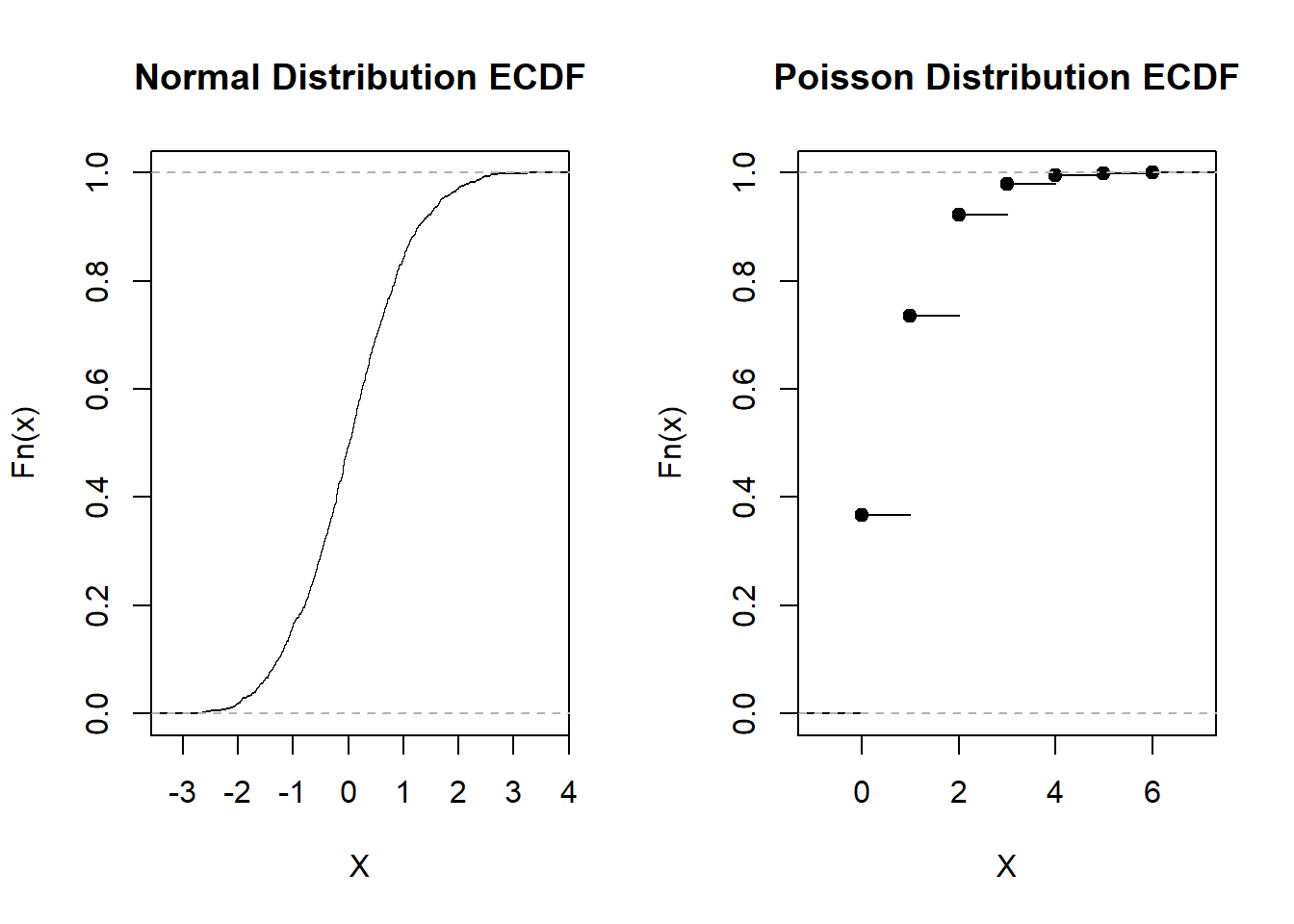
par(mfrow=c(1,1))We can see the normally distributed predictor has a very continuous, smooth curve. However, the ECDF for the Poisson variable is very rigid and has sharp discontinuities. We cannot easily generalize the first distribution to the second one with this issue. Therefore, we remove the step issue by interpolating over it. As you recall, this means estimating the space between points. We can now run DHARMa’s version on the same discrete variable and compare what it does.
e3 <- DHARMa.ecdf(x.pois)
plot(e3, main = "DHARMA ECDF of Poisson", xlab = "X")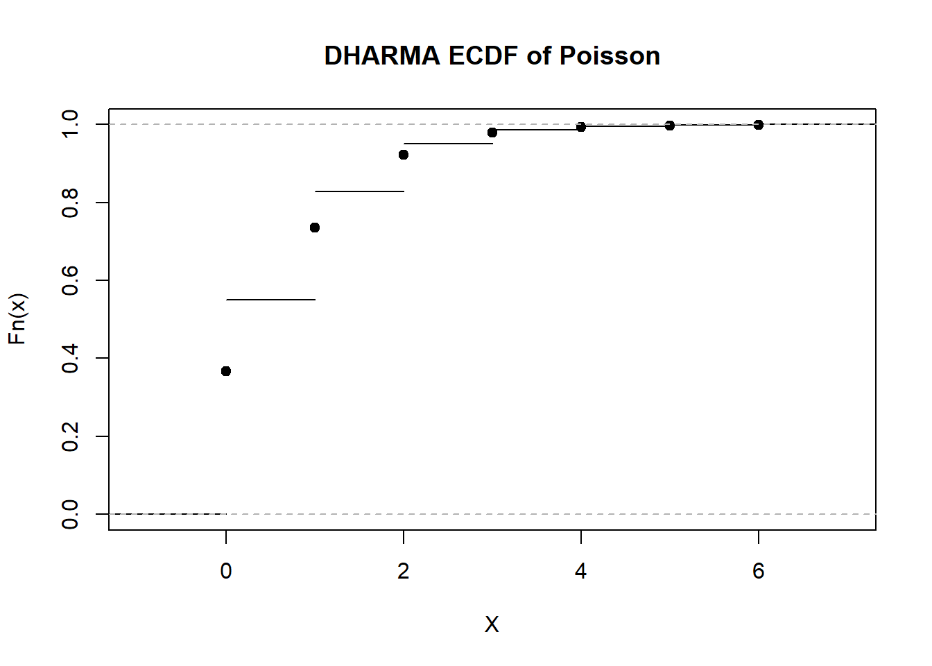
Notice the steps are now between the dots we had earlier. These function a bit like placeholders for later when we scale our residuals. Its important to take in what just happened though. We basically put these placeholders between the discrete values so that we can estimate values between them. This will be important later when the dots are jittered to create a truly continuous distribution.
Major Takeaway From Step 2
Remember that at Step 1, we simply simulate from the model to see if it generates a distribution of responses that match our assumptions. At Step 2, we calculate an ECDF of those simulated values using a convenient interpolation function within DHARMa. These values, now recalibrated to match a scale from 0 to 1, can now be generalized across models. However, there is still one last step for estimating DHARMa residuals…
Step 3: Creating Scaled Residuals
Thankfully, the final step for scaling the residuals is quite simple (sort of). The internal function in DHARMa that achieves this, getQuantile(), is understandably verbose and hard to read. However, the most important part for conceptual knowledge is below. You will see that this is a for loop that creates a vector of scaled residuals used for all the DHARMa checks. The first for loop is for integer responses (e.g. Poisson) and the second is for continuous responses (e.g. Gaussian).
    for (i in 1:n) {
      if (integerResponse == T) {
        # For integer responses, jitter both simulations and observed
        scaledResiduals[i] <- DHARMa.ecdf(simulations[i, ] + runif(nSim, -0.5, 0.5))(
          observed[i] + runif(1, -0.5, 0.5)
        )
      }
      else {
        # For continuous responses, no jitter
        scaledResiduals[i] <- DHARMa.ecdf(simulations[i, ])(observed[i])
      }
    }
Let’s start with continuous responses first, as we only add one extra step for discrete values. For continuous values (the bottom for loop), we plug in two values. For observed[i], we plug in the actual values we collected from our sample. So if the first observation is IQ = 100, then observed[1] is literally equal to 100. The other input is simulations[i, ]. These are all the default 250 simulated responses for this first observation. What this in effect does is ask R:
- We have some IQ value we observed from our data…
- We simulated what that observation should be 250 times from our model…
- This model and its simulated data tells us what we should expect from the population…
- Given that, what is the ECDF of our observed value using the ECDF constructed from our simulated data?“
From there, R will just evaluate the ECDF of the observed data point. That probability is the scaled residual of observation \(i\). Let’s break down what that may look like. Suppose we have an observed IQ of 100 again. Now suppose we simulated it’s value 10 times from our model and get back a vector of these 10 values:
\[ \text{IQ} = [80, 90, 100, 100, 100, 140, 150] \] We can again calculate the ECDF by simply plugging in the distribution of simulated values and the observed data point:
iq.simulated <- c(80, 90, 100, 100, 100, 140, 150)
iq.observed <- 100
ecdf_fun_dharma <- ecdf(iq.simulated)
ecdf_fun_dharma(iq.observed)
[1] 0.7142857Our ECDF tells us that, using the simulated distribution, .714 (71.4%) of the simulated values are equal to or below an IQ of 100. This .714 is our new scaled residual for observation 1. We just do this for every observation in our data, so that it hopefully has a uniform distribution between 0 and 1. Now suppose we have \(n = 1000\) observed data and \(s = 250\) simulations. Each raw observation is plugged into an ECDF of 250 simulated values. The value from that is a number from 0 to 1. Doing this 1,000 times gets us 1,000 values that should be uniformly distributed from 0 to 1 now. And that’s basically it for a continuous response.
The problem is that this doesn’t quite work for a discrete response for the reasons we outlined earlier. However, our DHARMa.ecdf() function is going to come to the rescue in a minute. It just needs one minor adjustment. Remember those placeholders from the linear interpolation? If we get values below or above that, we simply add some randomly jittered data round it. That is what the runif() function is doing above.
Let’s see this in action. I will plot the ECDF of some Poisson distributed data again (which once more should be very discrete and have only a finite number of values). Then I will compare it to the jittered ECDF from the DHARMa.ecdf() function.
#### Create Simulated Values of Poisson ####
set.seed(123)
sim_vals <- rpois(100, lambda = 2)
n_sim <- length(sim_vals)
obs_val <- 2

#### Simulate ECDF Without Jittering ####
par(mfrow=c(1,2))

plot(
  DHARMa.ecdf(sim_vals),
  main = "DHARMa ECDF (Raw)",
  xlab = "Observed Value (Raw)",
  ylab = "Cumulative Probability"
  )

#### Simulate ECDF With Jittering ####
plot(
  DHARMa.ecdf(sim_vals + runif(n_sim, -0.5, 0.5)),
  main = "DHARMa ECDF (Jittered)",
  xlab = "Observed Value (Jittered)",
  ylab = "Cumulative Probability"
  )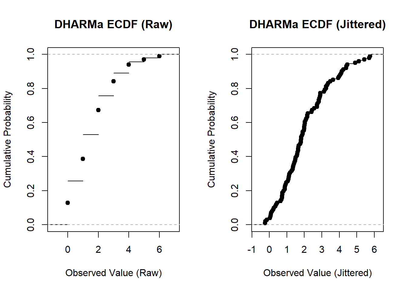
par(mfrow=c(1,1))We can now clearly see that the second plot more closely resembles the Gaussian version…instead of sharp breaks at each discrete value, it instead has many values distributed evenly across the line.
Major Takeaway From Step 3
Step 1 involved simulating from the model. Step 2 involved building a generalizable ECDF. Step 3 produces the scaled residuals by plugging in the simulated and observed values into the ECDF and then jittering those values if they are discrete.
Putting it All Together: Building the DHARMa Plots
The QQ Plot
From here, it will be easier to build the two primary plots from the DHARMa package. Let’s start with the QQ plot since it is simpler. Since we now know how the scaled residuals are constructed, we will simply pull them from the simulatedResiduals() object produced for a model and use those for our plots.
set.seed(123)
n <- 100
x <- rnorm(n)
y <- rpois(n, lambda = exp(0.5 * x))
model <- glm(y ~ x, family = poisson)
s <- simulateResiduals(model) # get simulated residuals
scaled_res <- s$scaledResiduals # pull scaled residuals from s
From here, the only thing we have to do now is plot this on a standard QQ line. The MKpower package has a nice function for creating ggplot2 style QQ plots without a lot of wiggling around with the parameters like other packages. This will plot a theoretical uniform distribution from 0 to 1 against the observed distribution from our simulated residuals. The line and dots should closely align with each other. In particular, it would be nice with the dots are within the confidence ribbon that surrounds the line and dots.
#### Run QQ Line ####
qqunif(s$scaledResiduals)+
  labs(title = "QQ Line with 95% CI")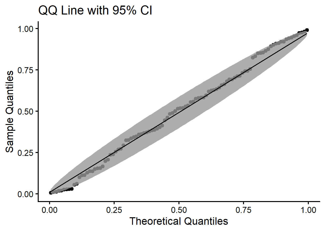
Our model appears to be safe. Notice that we can produce a very similar line with the native testUniformity() function in DHARma, though it will not automatically contain a CI ribbon.
invisible(testUniformity(s))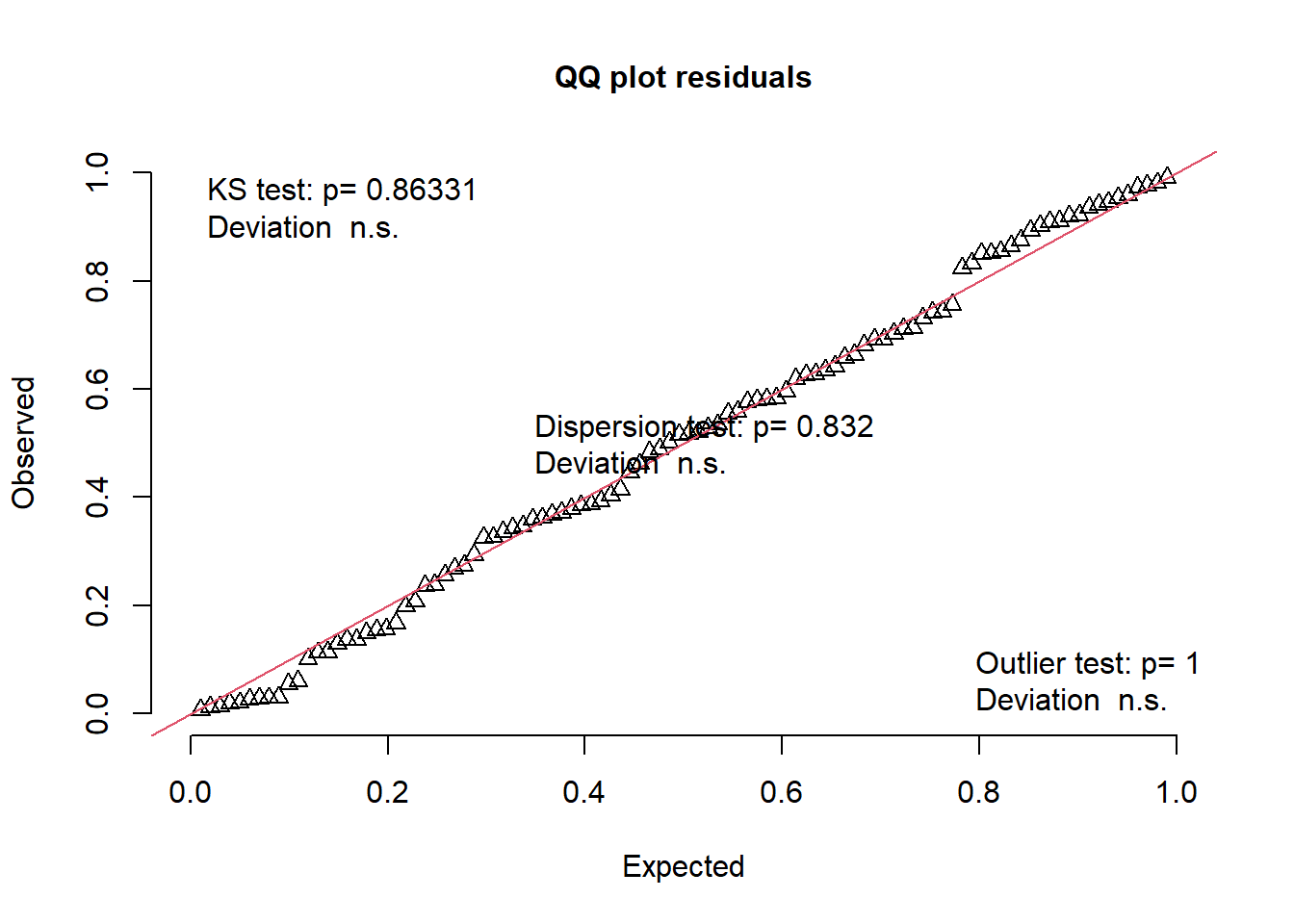
The Quantile Regression Plot
The second plot is akin to a fitted vs residual plot from OLS residual plots. However, this plot uses something like a quantile regression with splines, which is called a quantile generalized additive model (QGAM, Fasiolo et al., 2021). This does two things:
It fits a regression line not just for the conditional average of the response (here Q50 or the median), but also higher values of the response (Q75) and lower values of the response (Q25). In this way, we can see if our predictions change across the entire response distribution rather than just the average response. For example, if the variance increases as a predictor increases, then we should expect the lines from the QGAM to be non-parallel (which we don’t want).
These regression lines are constructed from penalized splines, which allow fitting nonlinear associations flexibly. So if for example there is a quadratic curve in the data that we haven’t modeled, this will show up curvy in this plot because of the splines (which we also don’t want).
Our plot here should have one focus: all 3 regression lines should be horizontal and parallel to each other, otherwise the model may be mis-specified. Recreating what is done in DHARMa requires a bit more code, so I will simply add code that produces a very rough version of the plot to give you an idea of what it does. The steps below essentially entail the following:
- Create a dataset which has the predicted response (rank-transformed) and the scaled residuals.
- Fit a QGAM which predicts the residuals with the predicted values. This is similar to what is done in a standard Fitted vs Residuals plot in OLS. The only difference now is its a QGAM.
- Generate a sequence of values to recreate the regression lines for each quantile.
- Plot the data and then overlay the regression lines and reference lines for each quantile.
The code is below:
#### Create Prediction and Residual Dataset ####
pred <- rank(s$fittedPredictedResponse) / length(s$fittedPredictedResponse)
res <- s$scaledResiduals
quant.data <- data.frame(pred = pred, res = res)

#### Assign Quantiles ####
qu <- c(.25, .50, .75)

#### Fit QGAM ####
fit.qgam <- mqgam(
  res ~ s(pred),
  qu = qu,
  data = quant.data
)
Estimating learning rate. Each dot corresponds to a loss evaluation.
qu = 0.5...............done
qu = 0.25........done
qu = 0.75.........done #### Create Grid of Values for Predictions ####
xseq <- seq(min(pred), max(pred), length.out = 200)
#### Generate Predictions for Each Quantile ####
preds <- list(
qdo(fit.qgam, qu[1], predict, newdata = data.frame(pred = xseq)), # Q25
qdo(fit.qgam, qu[2], predict, newdata = data.frame(pred = xseq)), # Q50
qdo(fit.qgam, qu[3], predict, newdata = data.frame(pred = xseq)) # Q75
)
#### Plot Raw Scatter ####
plot(
pred,
res,
xlab = "Model predictions (rank transformed)",
ylab = "DHARMa residuals",
main = "QGAM of Fitted vs Residuals"
)
#### Add QGAM Lines ####
lines(xseq, preds[[1]], lwd = 2) # Q25
lines(xseq, preds[[2]], lwd = 2) # Q50
lines(xseq, preds[[3]], lwd = 2) # Q75
#### Add Reference Lines for Quantiles ####
abline(h = .25, lty = "dashed")
abline(h = .50, lty = "dashed")
abline(h = .75, lty = "dashed")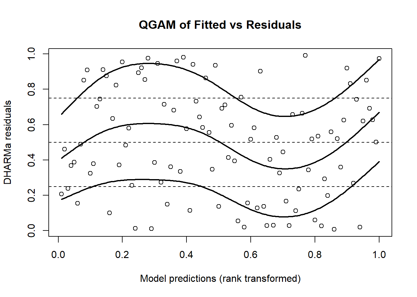
A comparison with the DHARMa plot shows a plot that is very similar but not exact.
invisible(testQuantiles(s))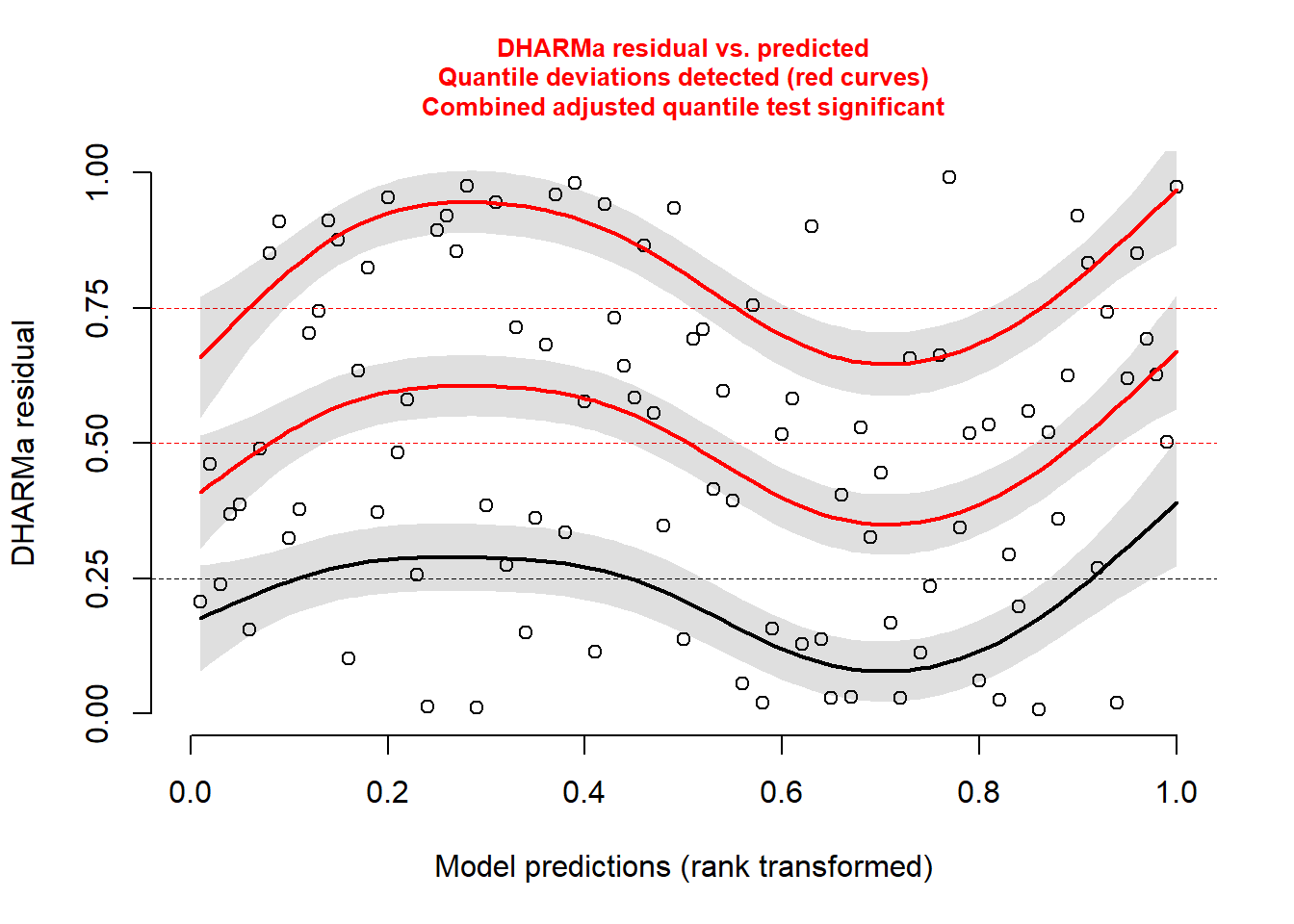
And thus this ends the journey through the basics of DHARMa.
Reviewing the Steps
If you have made it this far, you have covered a lot of ground. To consolidate what has been said, DHARMa residuals are created in the following way…
First, you fit a model (such as a standard linear regression). After, you simulate response data from this model for each observation.
For each observation, calculate the empirical cumulative density function for the simulated observations. To accommodate discrete responses, a linear interpolation is used for this ECDF.
A scaled residual is constructed by either getting the ECDF of a continuous response or an interpolated ECDF with jittering for a discrete response. A residual of 0 means that all simulated values are larger than the observed value. A residual of 0.5 means half of the simulated values are larger than the observed value.
Once this is done, you just plug these into the necessary plots and tests to assess model fit.
References
Fasiolo, M., Wood, S.N., Zaffran, M., Nedellec, R., & Goude, Y. (2021). Qgam: Bayesian nonparametric quantile regression modeling in R. Journal of Statistical Software, 100(9). https://doi.org/10.18637/jss.v100.i09
Gelman, A., Hill, J., & Vehtari, A. (2022). Regression and other stories. Cambridge University Press. https://users.aalto.fi/~ave/ROS.pdf
Hartig, F. (2017). DHARMa: Residual diagnostics for hierarchical (multi-level/mixed) regression models. https://cran.r-project.org/web/packages/DHARMa/vignettes/DHARMa.html
Westfall, P.H., & Arias, A.L. (2020). Understanding regression analysis: A conditional distribution approach. CRC Press, Taylor & Francis Group.